

Concept / Self-initiated
Khuraim
خريم
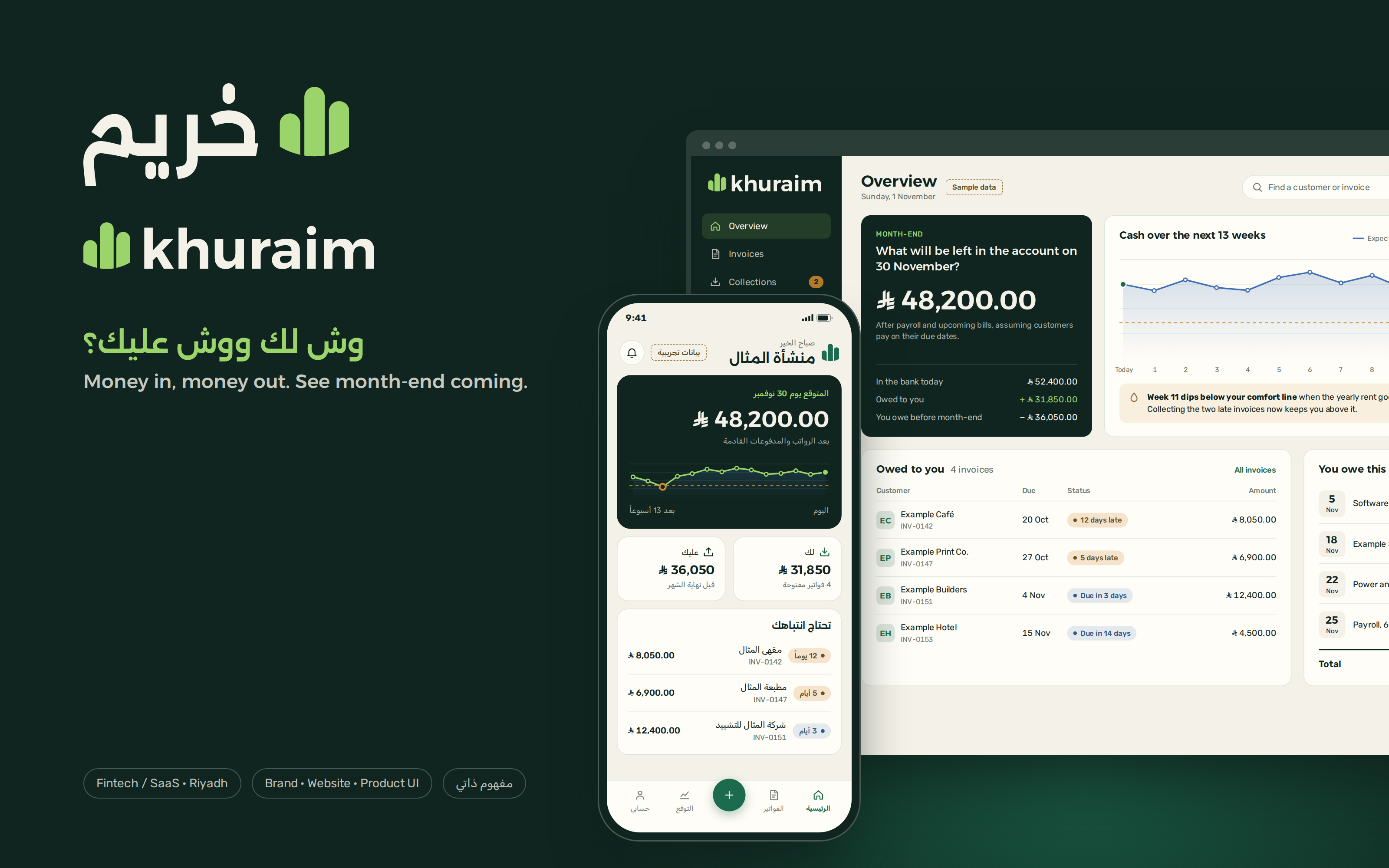
Brand, website and product UI for an imagined Riyadh SaaS that helps Saudi small businesses send invoices, chase what they’re owed and see the next thirteen weeks of cash, in Arabic first and English in full.
- Sector
- Fintech / SaaS, Riyadh
- Services
- Brand Kit, Website, Product UI
- Project
- Concept / Self-initiated
01
Brief
Khuraim is a self-initiated Najdunes concept, not client work. We imagined a Riyadh startup building one tool for the people who run small businesses here: a bakery, a small contractor, a design studio, an online shop, each keeping their money straight across a spreadsheet, a banking app and a WhatsApp thread.
The brief we set ourselves: a name, an identity and an interface system for a product that answers the question every owner asks near month-end. After payroll and rent, what’s left in the account, and who still hasn’t paid?
Deliverables: an Arabic and Latin logo, type and colour, a bilingual marketing site for desktop and mobile, a web dashboard, a mobile app and a bilingual tax-invoice template. Every figure on every screen is sample data, and every screen is flagged as such.
02
Research
This is desk research from public sources. We ran no interviews and no surveys, so nothing here describes what real users told us.
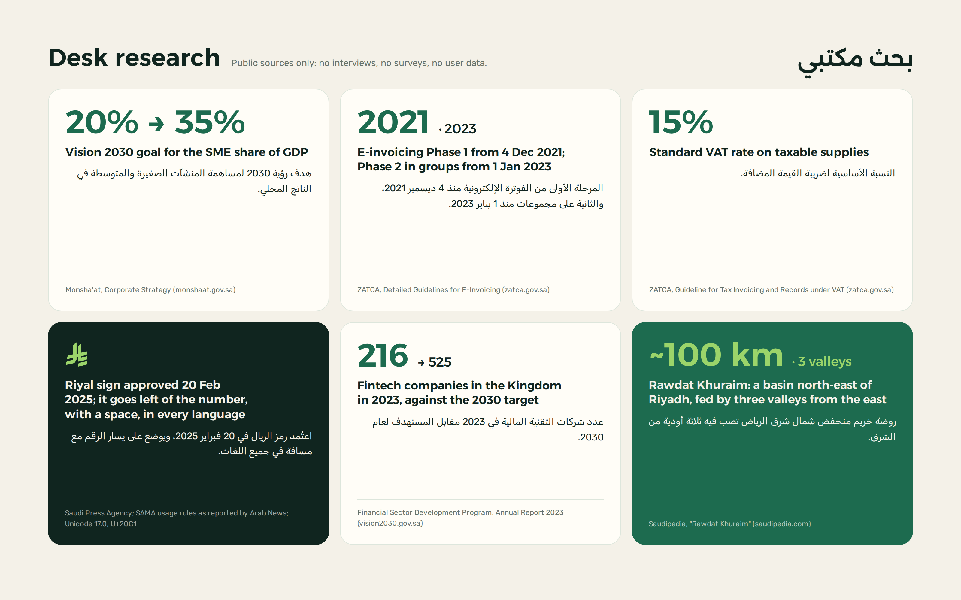
Small business is national policy. The corporate strategy of Monsha’at, the SME authority, restates the Vision 2030 goal of lifting the SME share of GDP from 20% to 35%.
Invoices are now data. ZATCA’s Detailed Guidelines for E-Invoicing say Phase 1 (generation) took effect on 4 December 2021 and Phase 2 (integration) rolls out in groups from 1 January 2023, each group notified at least six months ahead. ZATCA’s guideline on tax invoicing and records puts the standard VAT rate at 15%.
The riyal has a sign. The Saudi Press Agency reported its approval on 20 February 2025. Among the usage rules the Saudi Central Bank published, as reported by Arab News: the sign sits to the left of the number, with a space between them. Unicode 17.0 encodes it as U+20C1, but most fonts don’t draw it yet.
The field is crowded. The Financial Sector Development Program’s 2023 annual report counts 216 fintech companies operating in the Kingdom, against a target of 525 by 2030. A newcomer has to be recognisable at a glance.
The name is a place. Saudipedia describes Rawdat Khuraim as a basin about 100 km north-east of Riyadh, roughly 18 km long and 2.5 km wide, fed by three valleys from the east. It now lies inside the Imam Abdulaziz bin Mohammed Royal Reserve.
03
Strategy
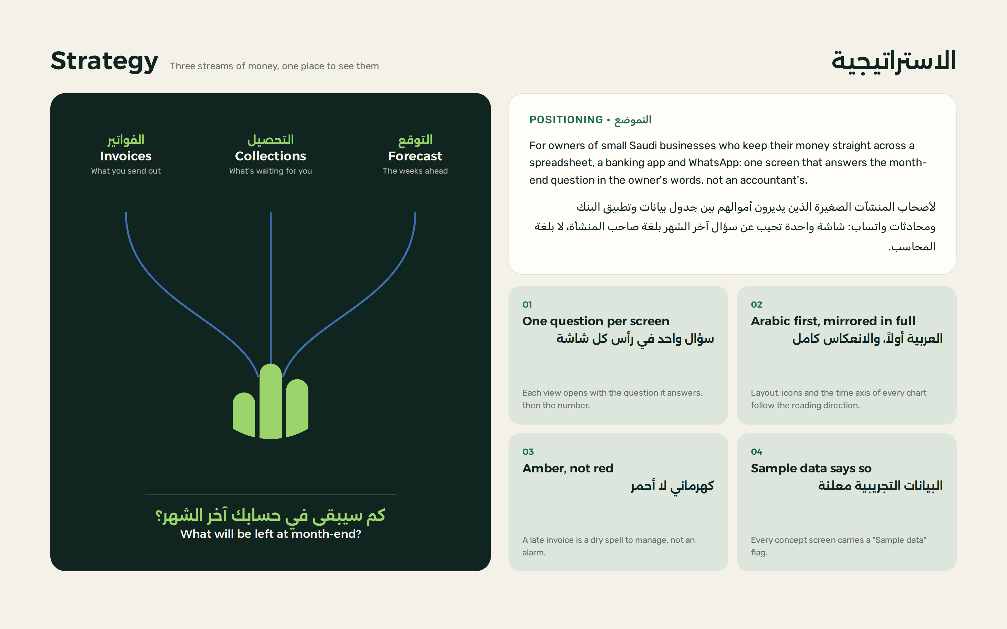
The idea comes from the name. A rawdah is a low basin where valley water gathers and the ground turns green after rain. Khuraim gathers what comes into a business and what goes out of it in one place, then shows what will be left in the weeks ahead.
Positioning: not a full accounting suite, but a daily tool for the owner. Plain words instead of accountant’s terms, and a clear question at the top of every screen, followed by the number that answers it.
The product has three streams, like the three valleys: invoices, collections and forecast. All of them feed one number, the expected balance at month-end, set on a thirteen-week timeline.
The tone is calm and direct. A late invoice shows in amber, not red, and every screen is designed in Arabic first, then mirrored in full for English.
04
Identity
Logo
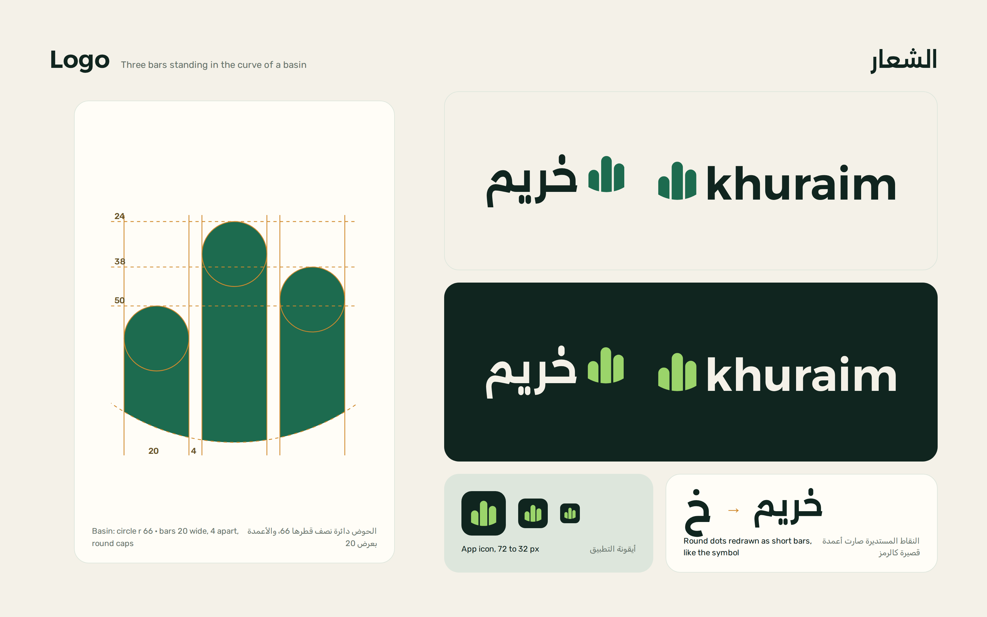
The symbol is three round-topped bars standing in the curve of a basin. It reads as a chart of money and as new growth coming up in a meadow. The tallest bar is in the middle rather than at one end, so the mark implies no reading direction and promises no endless climb.
The words خريم and khuraim are set in Alexandria and converted to outlines. The round dots are redrawn as short bars like the symbol’s. The Latin i keeps its round dot, because at small sizes a bar there made the word read as khuralm.
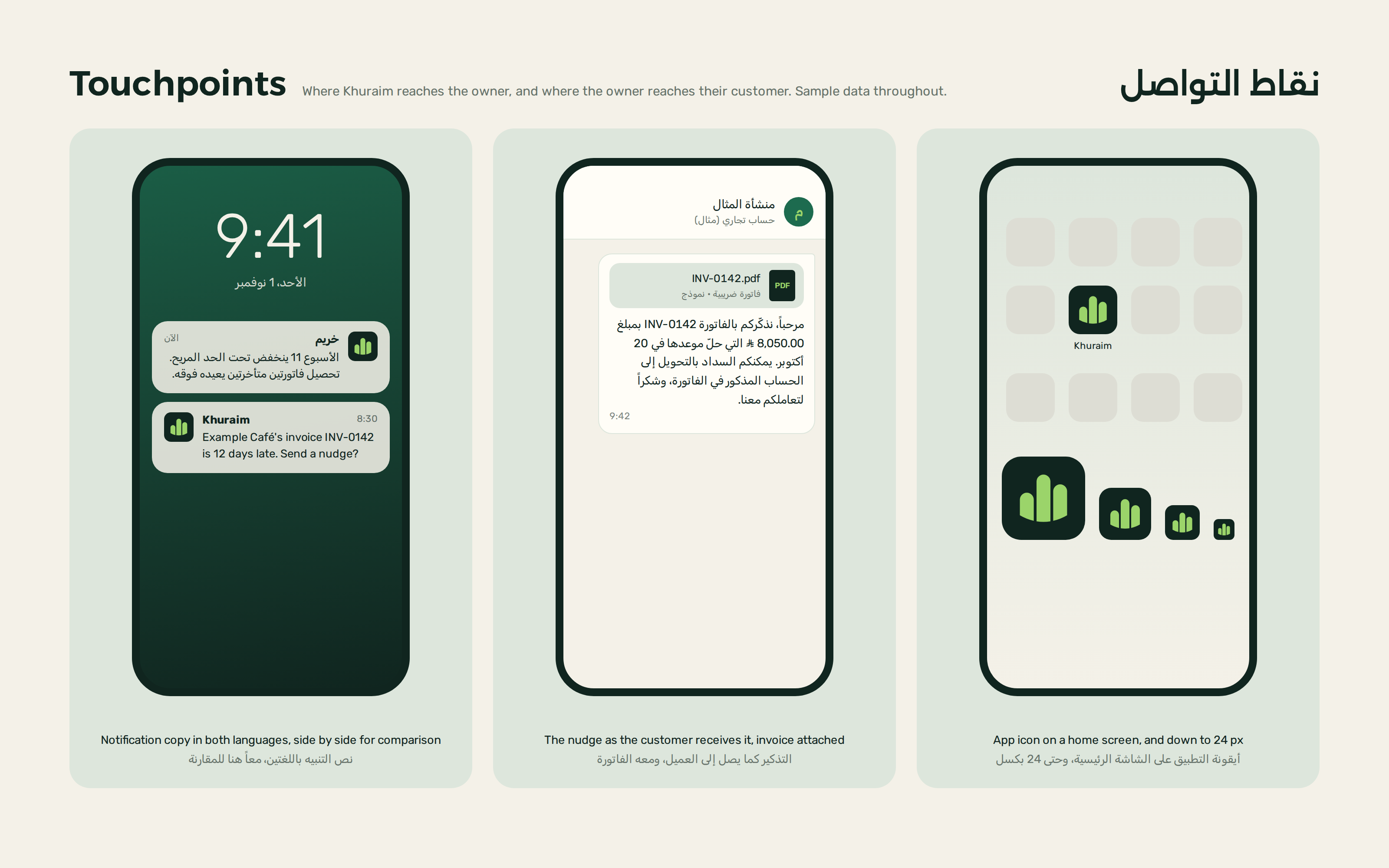
The Arabic lockup leads with the symbol on the right and the English one on the left. Both come in light and dark versions, and the app icon stays clear down to 24 px.


Typography
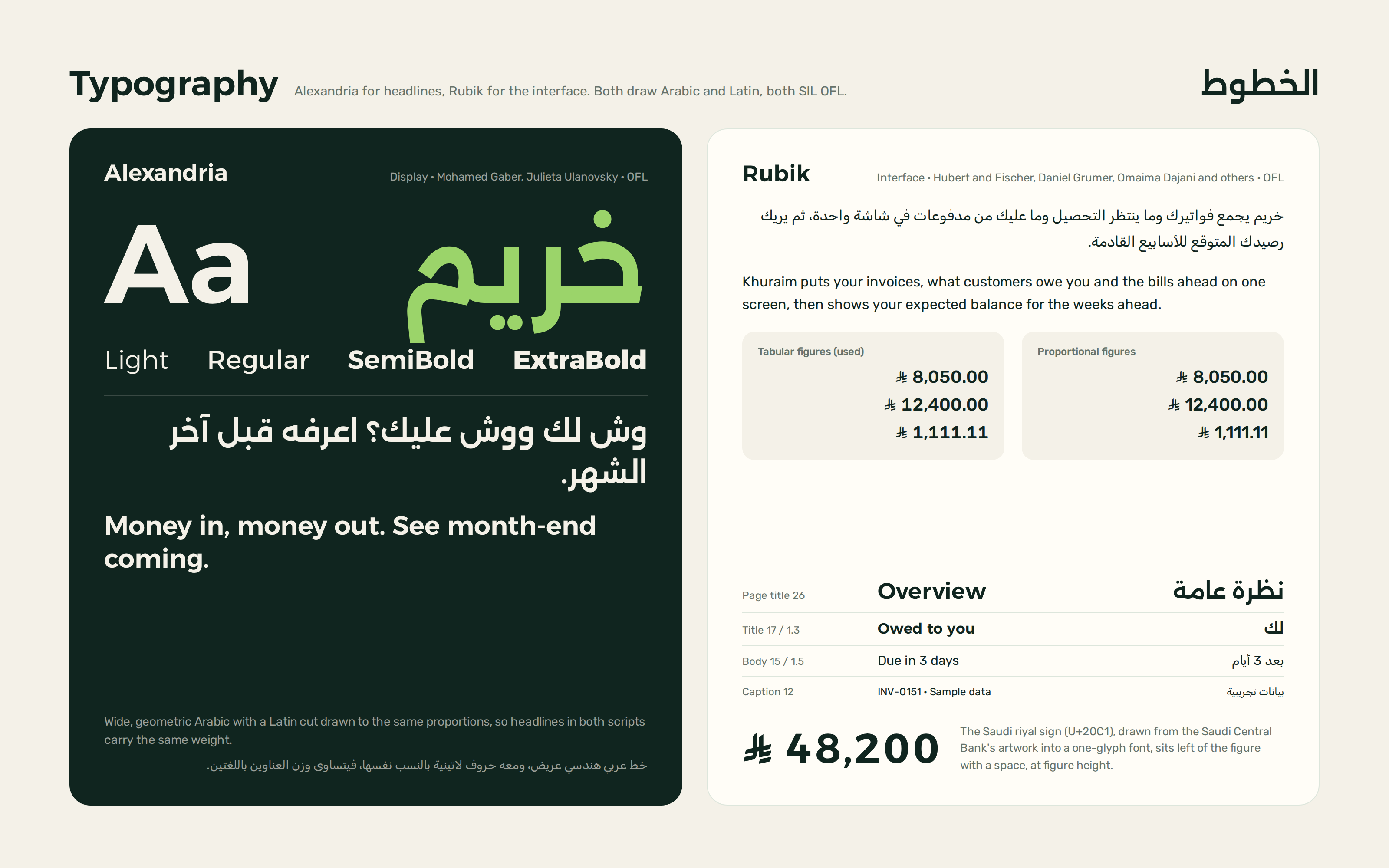
Alexandria sets the headlines: a wide, geometric Arabic with a Latin drawn to the same proportions, so a headline weighs the same in both languages. Rubik runs the interface: clear at small sizes, Arabic and Latin in one family, with tabular figures so amounts line up in columns.
Both are licensed under the SIL Open Font License and vendored with their licence files and a note on where each file came from.
Neither font has the new riyal sign yet, so we drew it from the Saudi Central Bank’s artwork into a one-glyph font mapped to U+20C1. The screens type the real character, which stays correct once system fonts catch up.
Colour
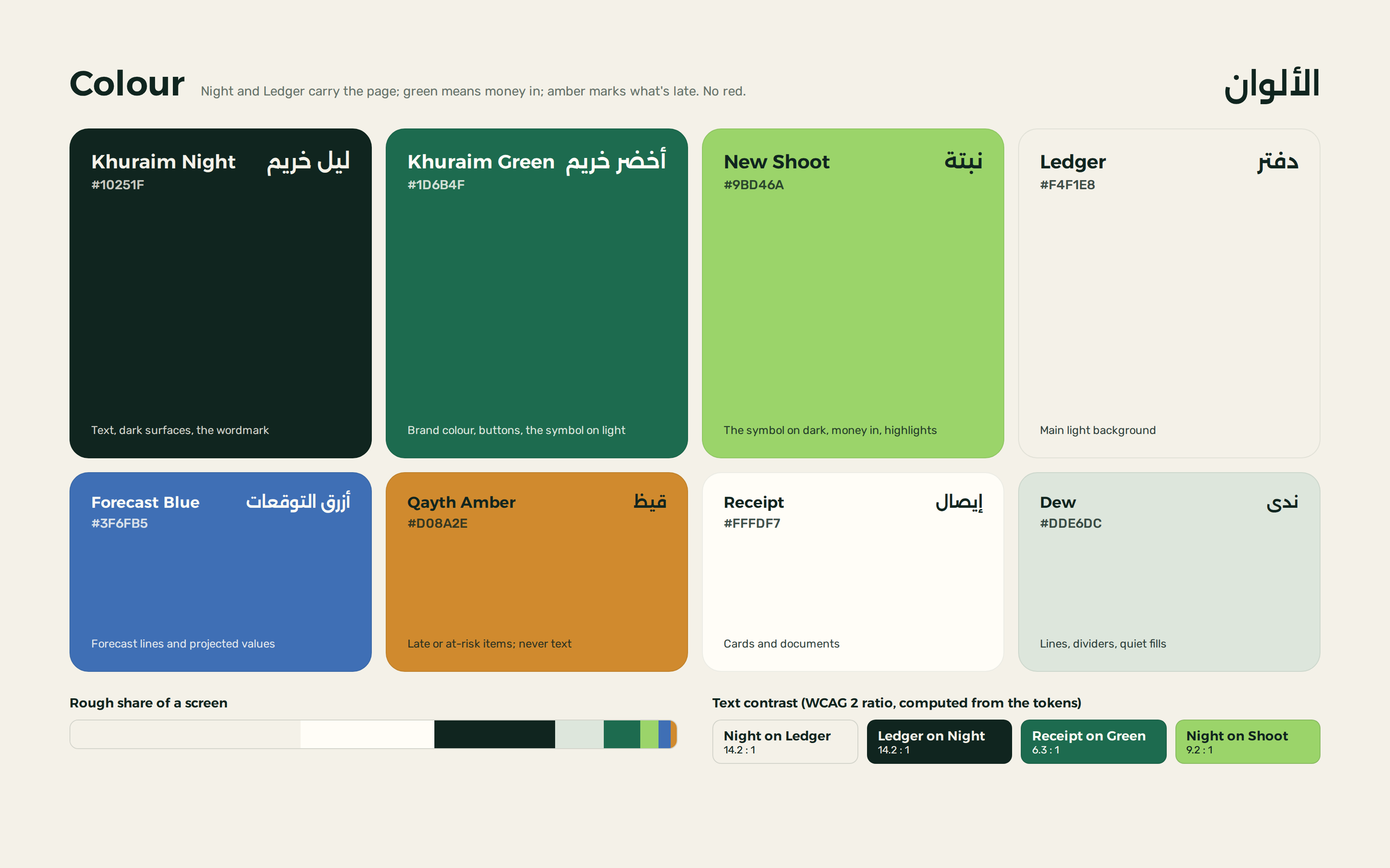
Khuraim Night and Ledger carry the page; green means the brand and money coming in. Khuraim Green is for buttons and the symbol on light grounds, New Shoot for the symbol on dark and for positive figures. The two light neutrals are named for the paperwork the product replaces: Ledger and Receipt.
Forecast Blue is kept for projected figures only, so what is expected never looks like what has already happened. Qayth Amber marks what’s late or at risk and is never used for text. There is no red in the palette.
Text contrast is computed from the token values: Night on Ledger is 14.2:1, Receipt on Khuraim Green 6.3:1.
Palette
- Khuraim Night
#10251F - Khuraim Green
#1D6B4F - New Shoot
#9BD46A - Forecast Blue
#3F6FB5 - Qayth Amber
#D08A2E - Ledger
#F4F1E8 - Receipt
#FFFDF7 - Dew
#DDE6DC
05
Applications
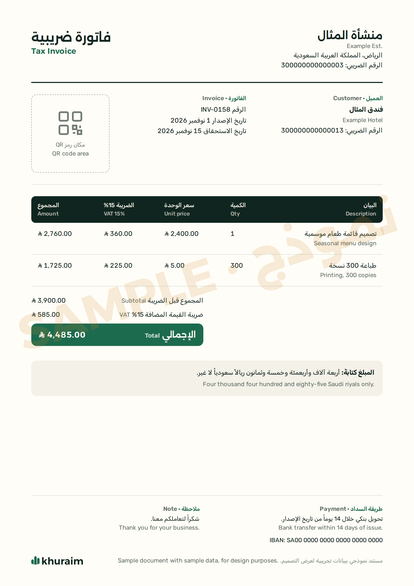
The tax invoice is one document in both languages: both parties’ details and VAT numbers, the lines, VAT at 15%, the amount in words and a place for the QR code. Everything on it is sample data, and a watermark says so.
Khuraim reaches the owner through notifications in the phone’s language, and reaches the owner’s customers through a polite WhatsApp nudge with the invoice attached. The app icon is drawn to hold its own on a crowded home screen.
06
Website and product
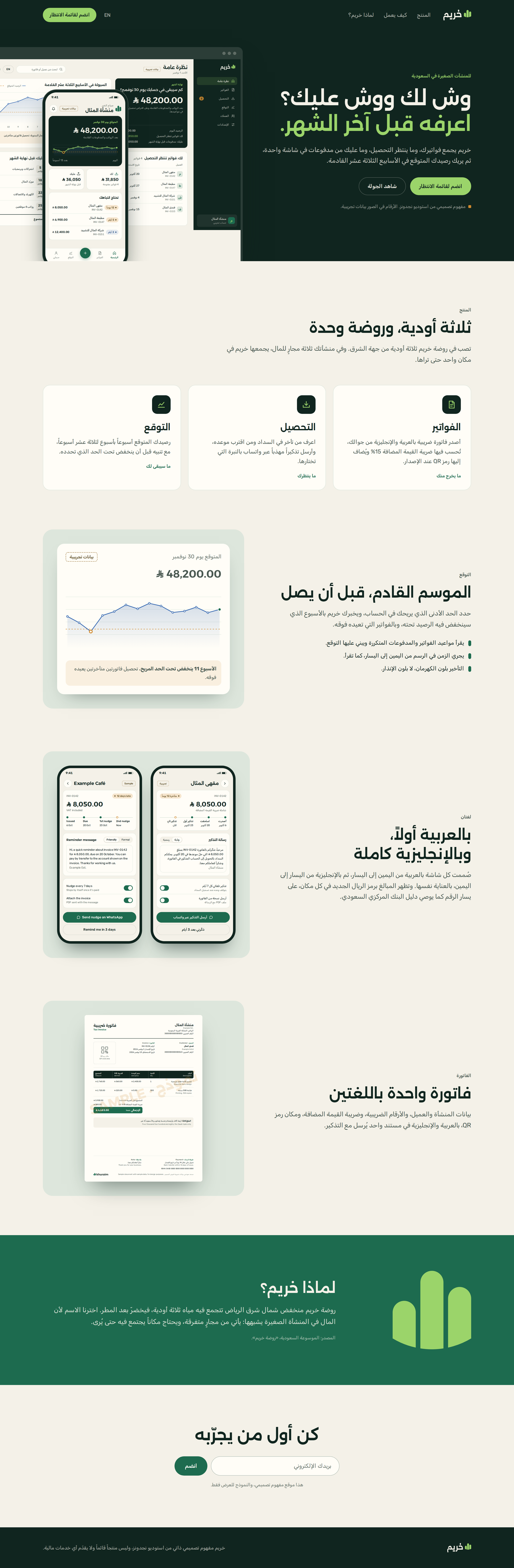
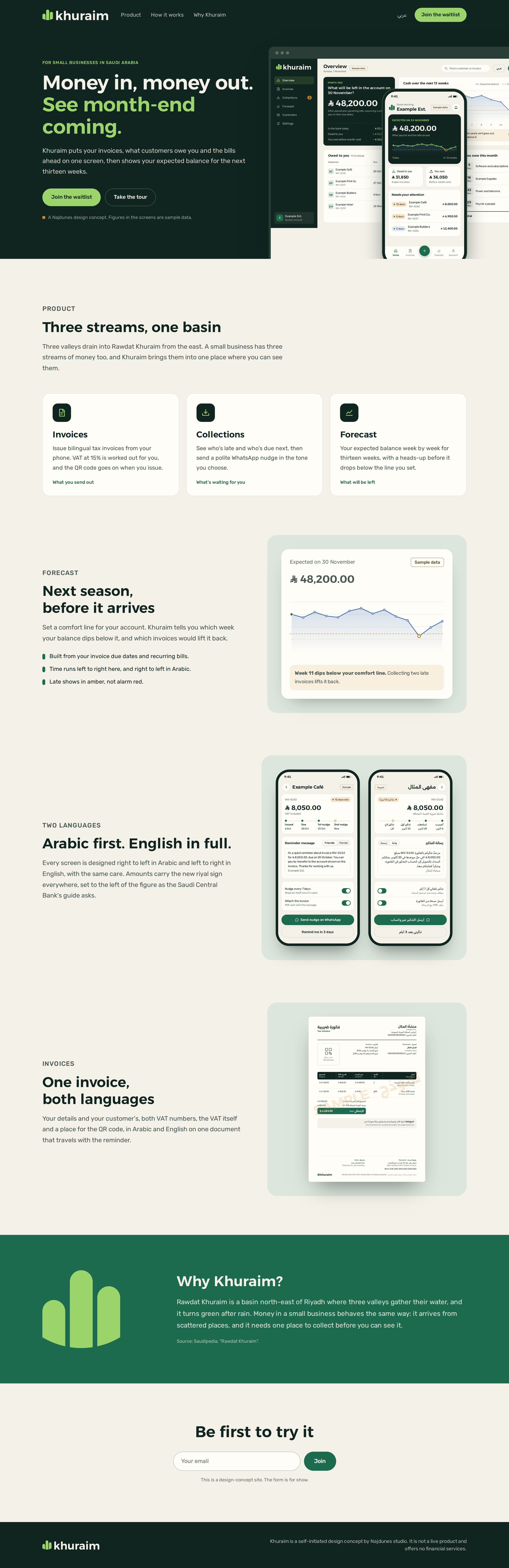
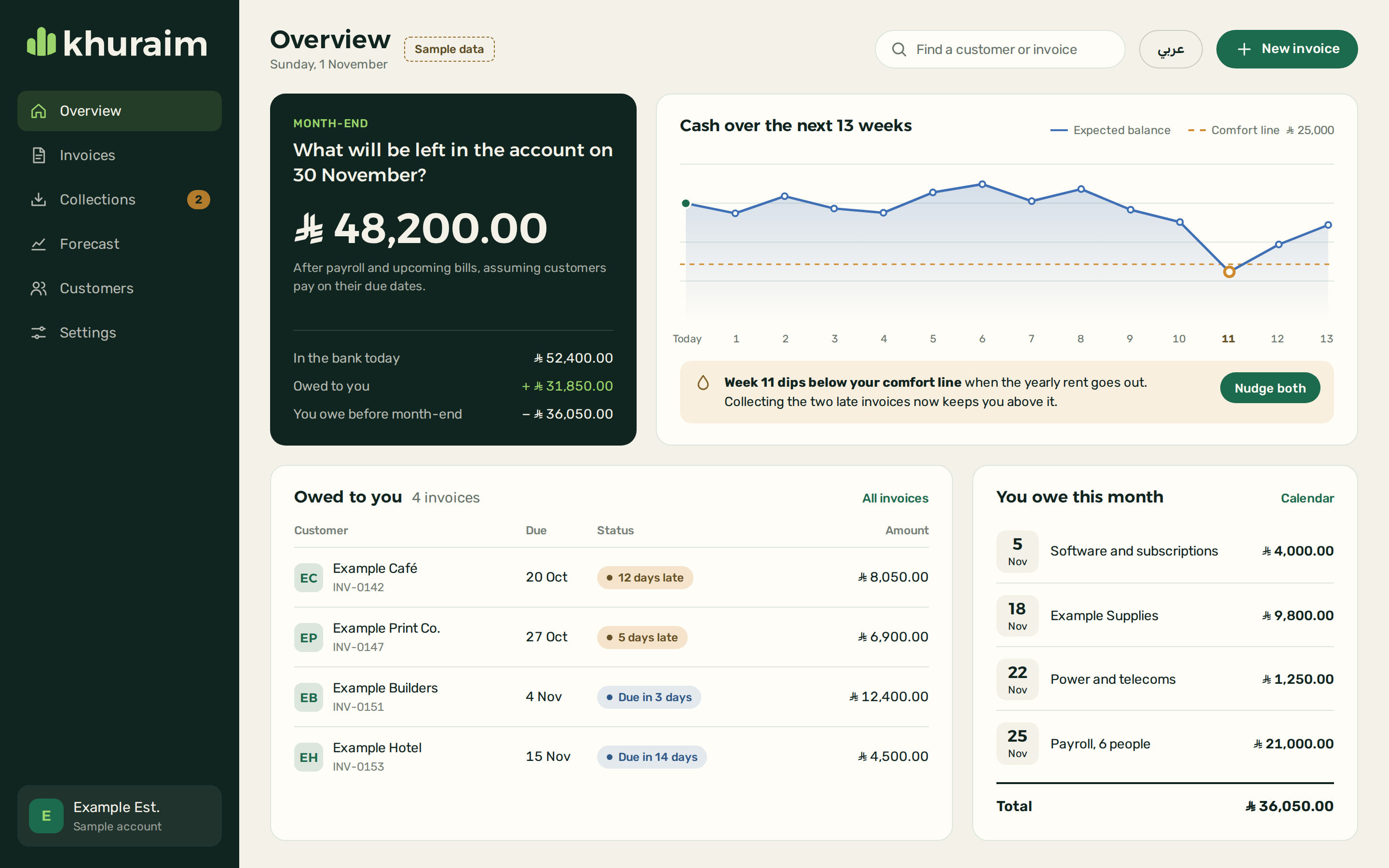
The marketing site opens on the same question, what’s coming in and what’s going out, then walks through the three streams, the forecast, the two languages, the invoice and the story of the name, and ends on a waitlist. Its product shots are the real interface pages scaled down, not separate illustrations.
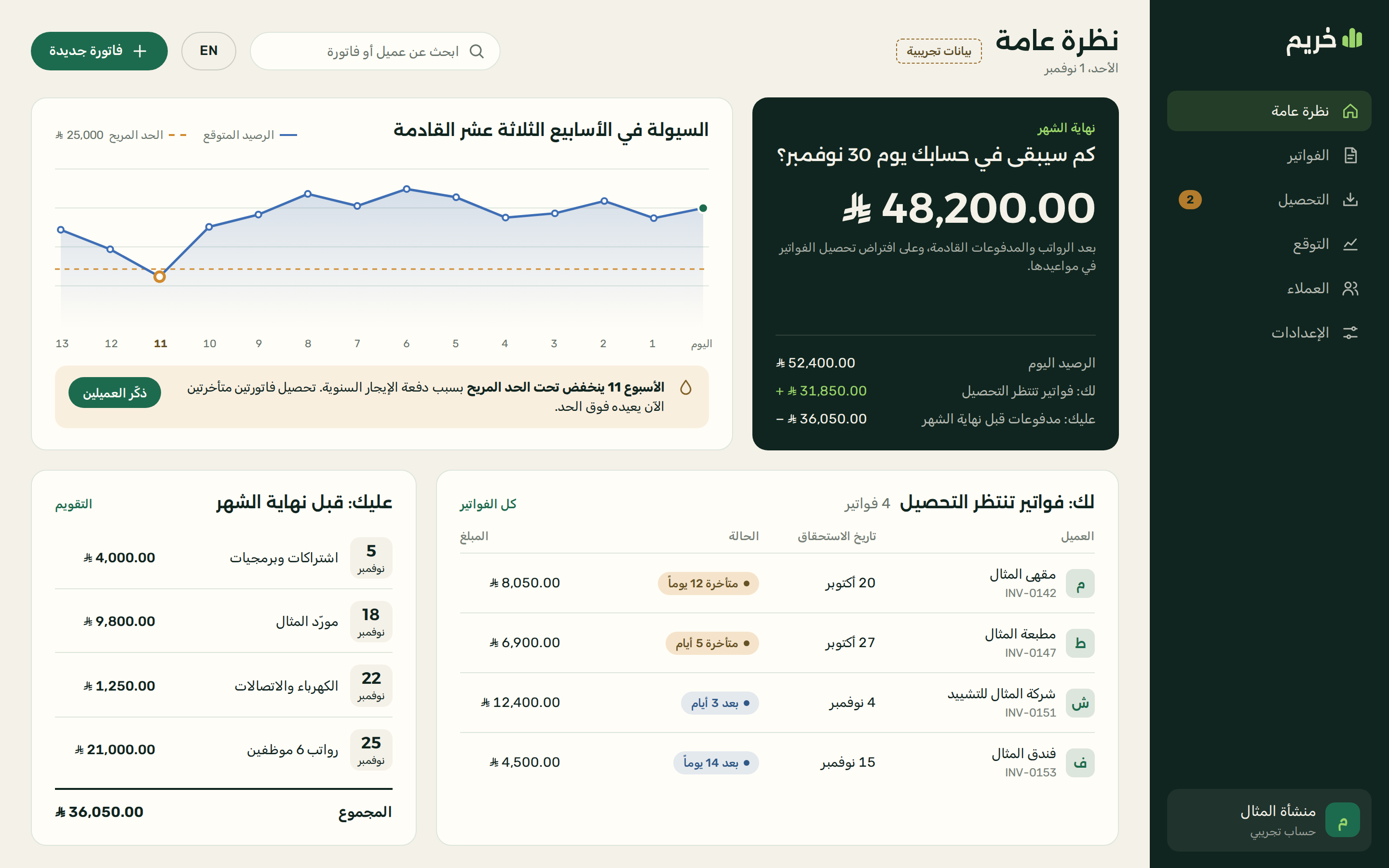
The web dashboard leads with one number: what will be left at month-end, and where it comes from. Beside it, a thirteen-week forecast runs right to left in Arabic and left to right in English, and flags the week the balance dips below the owner’s comfort line.
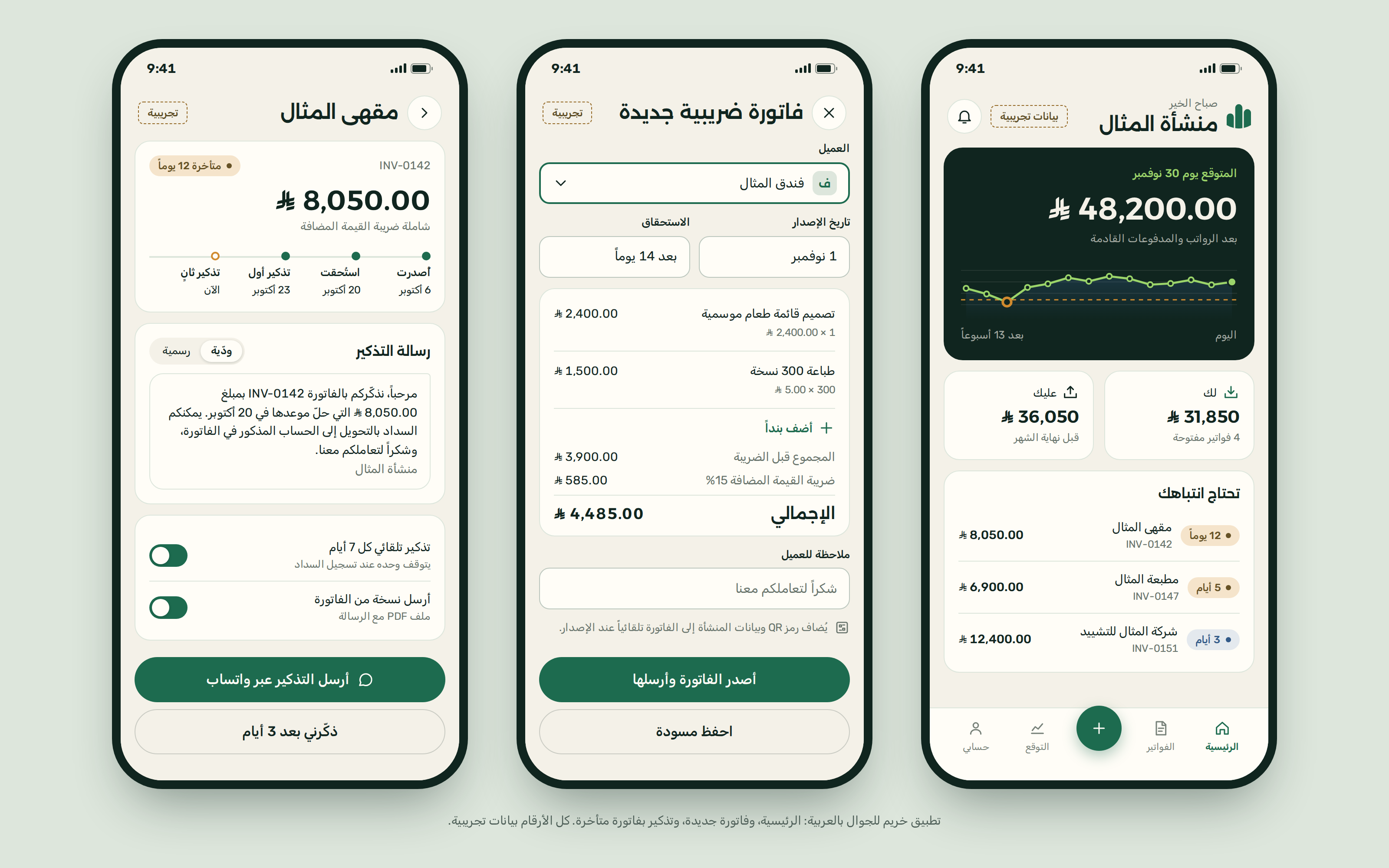
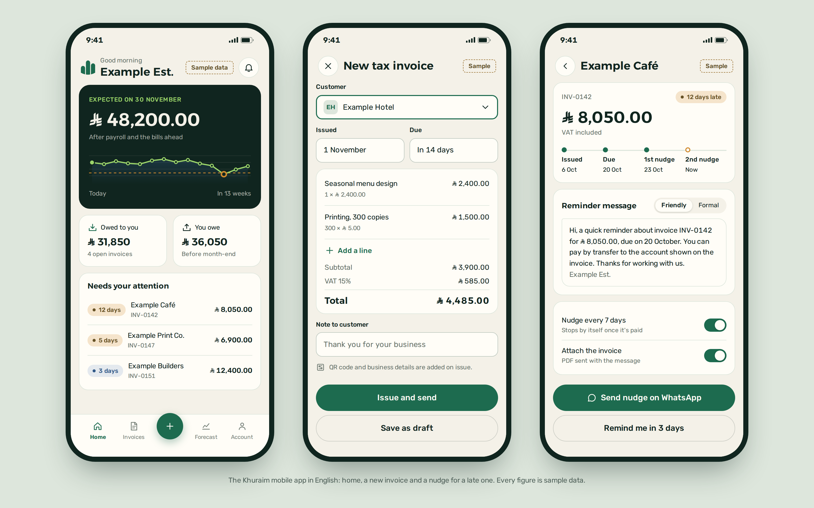
The mobile app narrows this to three jobs: a quick look, a new invoice and a nudge for a late payer. Every screen exists in Arabic and English, and every figure on them is sample data.
Desktop
Mobile


07
Why it looks the way it does
Every choice in the identity and the site has a reason. These are the ones that matter most.
The name Khuraim
A rawdah is a basin where three valleys pour in, and the product pools three streams of money in one place. The name is short, known around Riyadh and two syllables in either language.
It was also the cleanest name we screened (Najdunes name check, 1 November 2026): no mark in the Saudi Authority for Intellectual Property’s search, and no entry on the Saudi Central Bank’s lists of licensed or sandbox-permitted firms. The official Ministry of Commerce trade-name search is still owed before any real use.
The tallest bar in the middle
Bars rising from one end to the other promise endless growth and assume one reading direction. A peak in the middle reads as seasons rather than a staircase, and the mark stays right in Arabic and English layouts without mirroring.
Time follows the reading direction
In Arabic the forecast starts on the right with “Today” and moves left, because an Arabic reader follows time the way they follow a line of text. Layout, directional icons and charts all mirror together; figures and the logo do not.
The riyal sign left of the figure
The central bank’s guide puts the sign to the left of the number in every language, with a space. So every amount is set as a left-to-right run, even inside Arabic text, and the sign lands in the same place in both directions.
Amber instead of red
A small-business owner usually opens this screen already worried about cash. Red turns every late invoice into an alarm; amber says this needs attention, and here’s the next step.
Western digits in both languages
The same amount looks the same in the Arabic and English interfaces and on the invoice, so a figure copied from one language to the other doesn’t change shape. Arabic-Indic digits stay available as a setting for those who prefer them.
Sample data, labelled
This is a concept, not a live product. Every screen carries a “Sample data” flag, customers are named things like Example Café, and the numbers add up without pretending to be results.
Want this depth for your own brand?
Tell us about your project in a short brief, and we’ll come back to you with a clear next step.