

Concept / Self-initiated
Faydah
فيضة
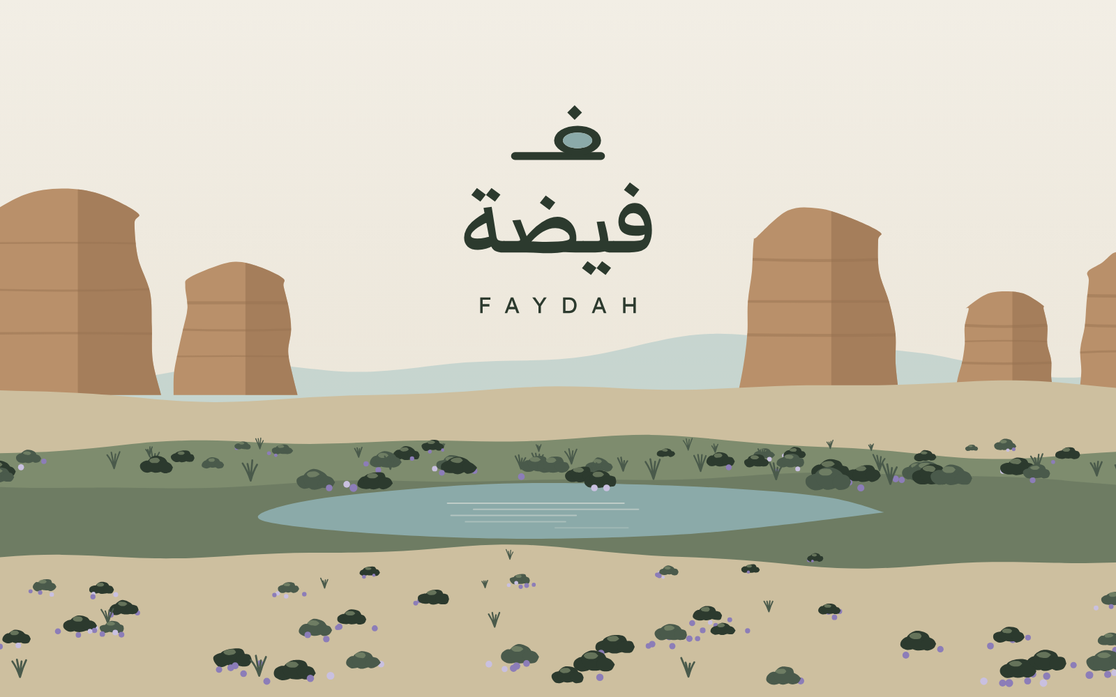
Identity and website for an imagined small desert stay in AlUla and Diriyah, named after the faydah: the low ground where rainwater settles.
- Sector
- Hospitality: boutique desert stay
- Services
- Brand Kit, Website
- Project
- Concept / Self-initiated
01
The brief
We wrote this brief ourselves. There is no client and no operating hotel behind it. We imagined a Saudi founder planning a small stay with two houses, one in the AlUla oasis and one on the bank of Wadi Hanifa in Diriyah, each with fewer than ten rooms.
The brand had to sit between AlUla’s large resorts and the familiar desert camp: quiet, Arabic at its root, legible to Saudi travellers and foreign visitors alike. The website had to be bilingual, Arabic first, and get a guest from first look to booked on a phone without friction.
Applications in scope: wayfinding, the room key card, the amenity kit and the booking confirmation.
02
Research
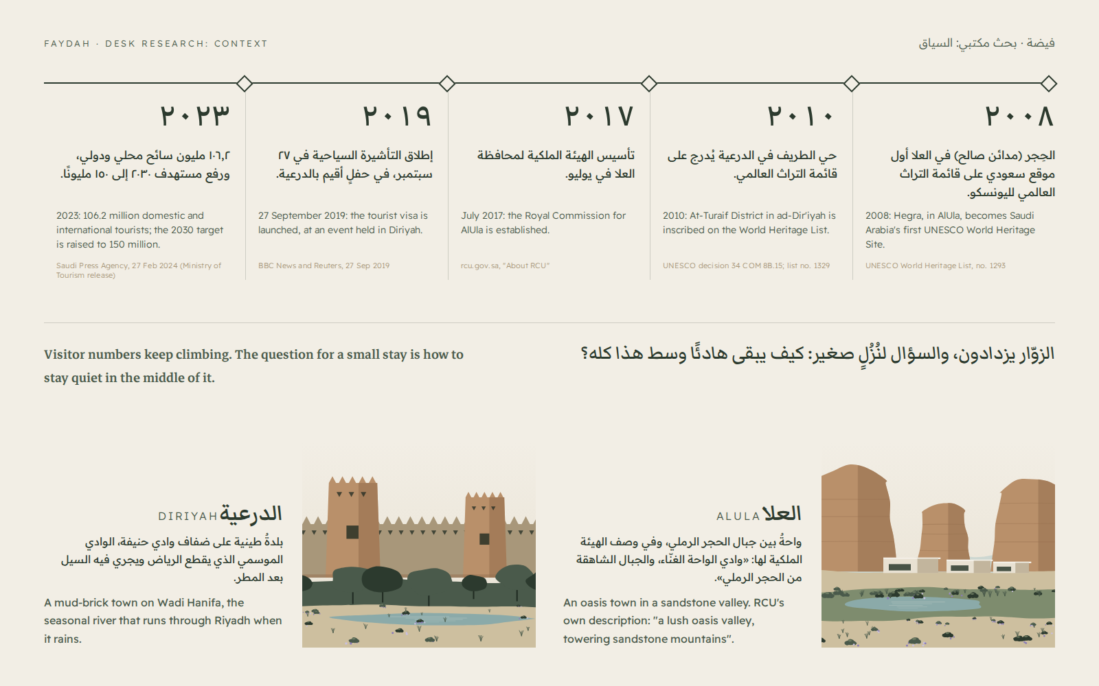
Desk research from public, checkable sources. The Ministry of Tourism reported 106.2 million domestic and international tourists in 2023 and raised the 2030 target to 150 million (Saudi Press Agency, 27 February 2024). The tourist visa was launched on 27 September 2019 at an event in Diriyah (BBC News, Reuters).
AlUla: Hegra became Saudi Arabia’s first UNESCO World Heritage Site in 2008, and the Royal Commission for AlUla was established in July 2017; RCU describes the governorate as “a lush oasis valley, towering sandstone mountains” (rcu.gov.sa). Diriyah: At-Turaif District was inscribed in 2010 (UNESCO decision 34 COM 8B.15), and the town sits on Wadi Hanifa, the seasonal river that runs through Riyadh.
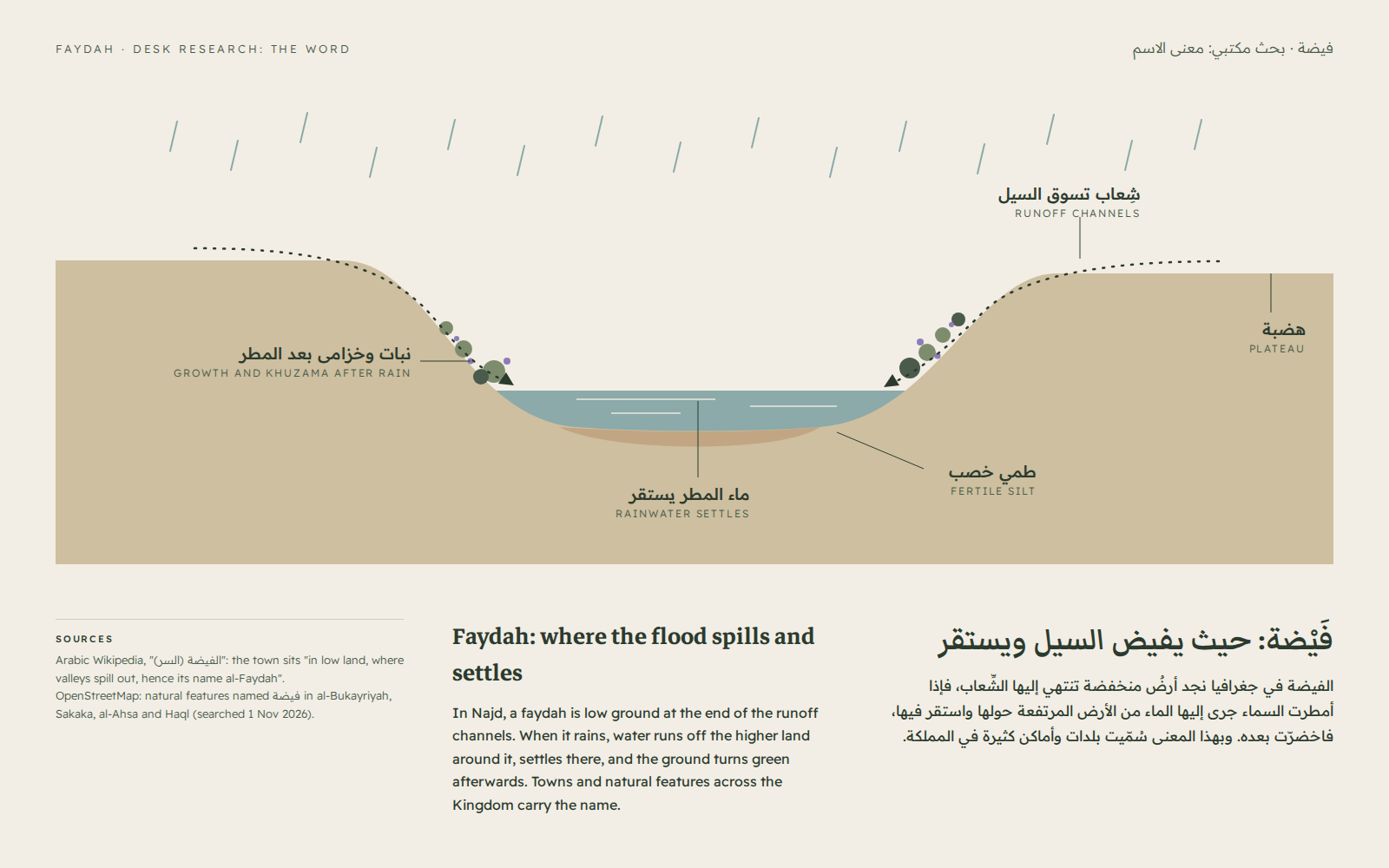
The name: Arabic Wikipedia’s entry on al-Faydah in al-Sirr says the town lies “in low land, where valleys spill out, hence its name al-Faydah”. An OpenStreetMap search turns up natural features called فيضة in al-Bukayriyah, Sakaka, al-Ahsa and Haql. A faydah is where water ends up and stays, and that is what AlUla and Diriyah share: both are places where water gathers in dry land.
Our own reading, an opinion rather than a figure: upscale stays in the region tend to speak one of two languages, international resort polish or Bedouin-camp imagery. That leaves room for a small, quiet, Arabic-rooted brand that sells slowness rather than spectacle.
03
Strategy
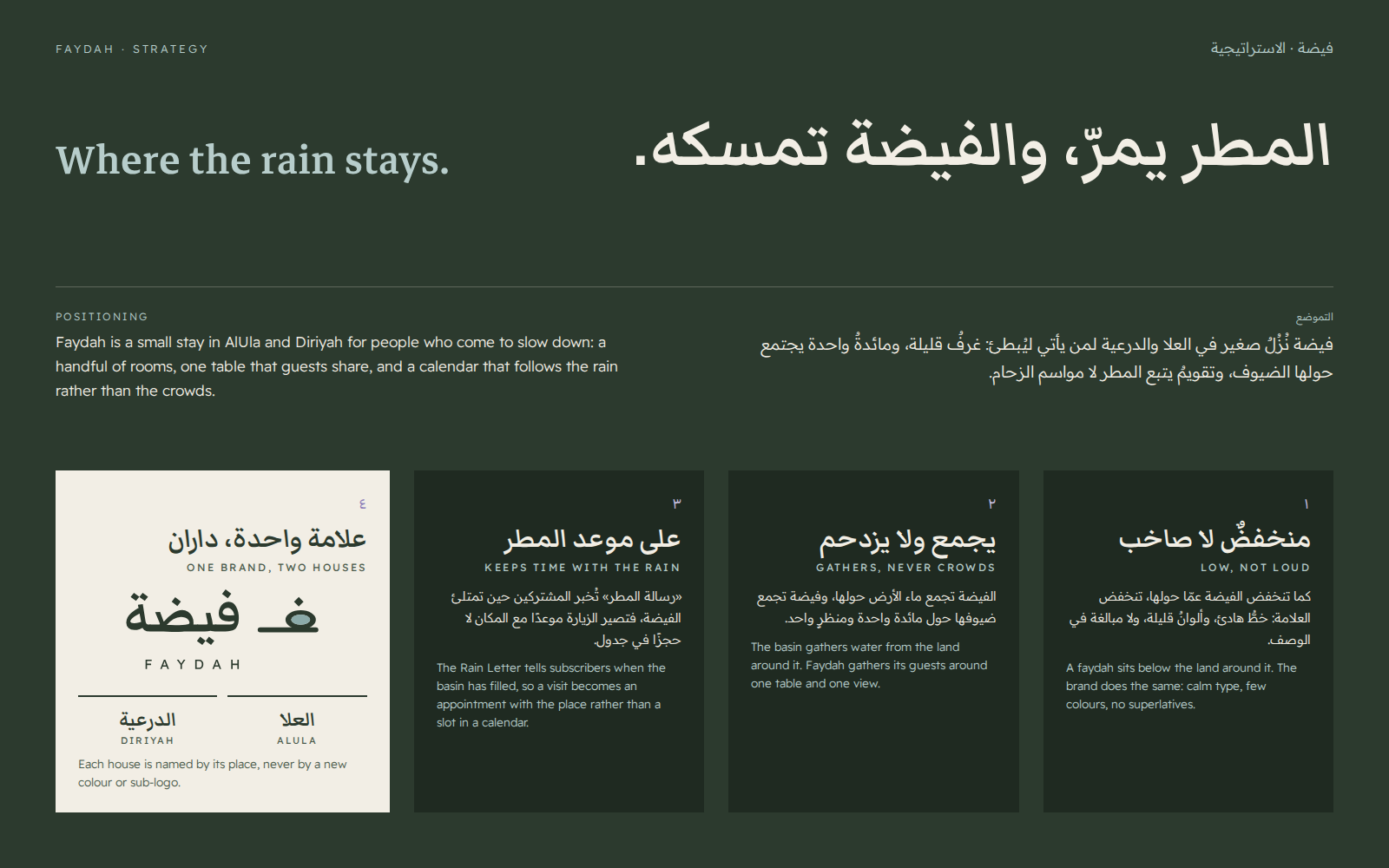
The idea: “Where the rain stays.” Faydah is for people who come to slow down: a handful of rooms, one table that guests share, and a calendar that follows the rain rather than the crowds.
Three principles decide everything else. Low, not loud: calm type, few colours, no superlatives. Gathers, never crowds: one table, one view. Keeps time with the rain: the Rain Letter tells subscribers when the basin has filled, so a visit becomes an appointment with the place.
One brand, two houses: Faydah AlUla and Faydah Diriyah. Each house is named by its place and carried by its own illustrated plate, never by a new colour or sub-logo, so the brand stays whole if more houses follow.
04
Identity
Logo
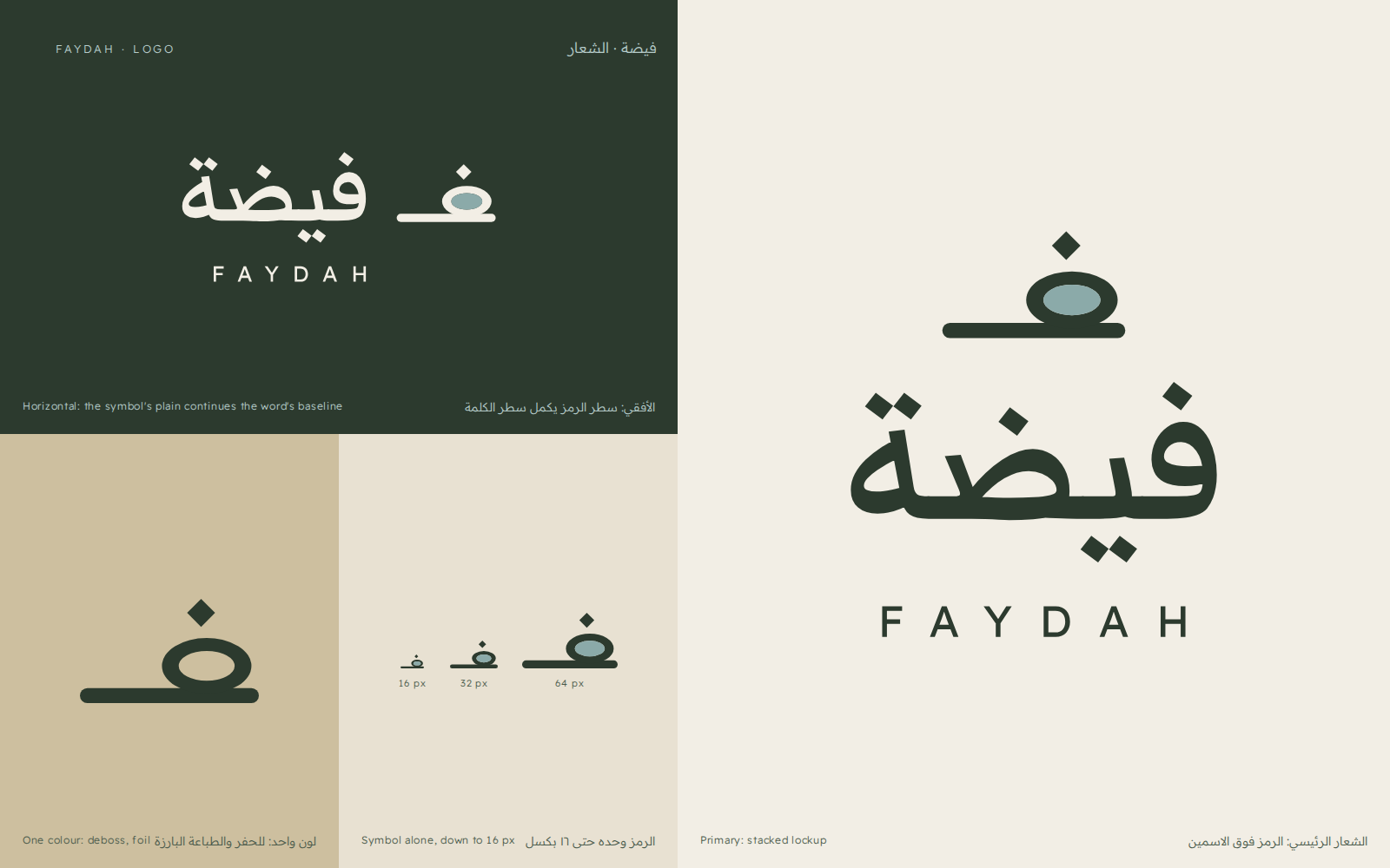
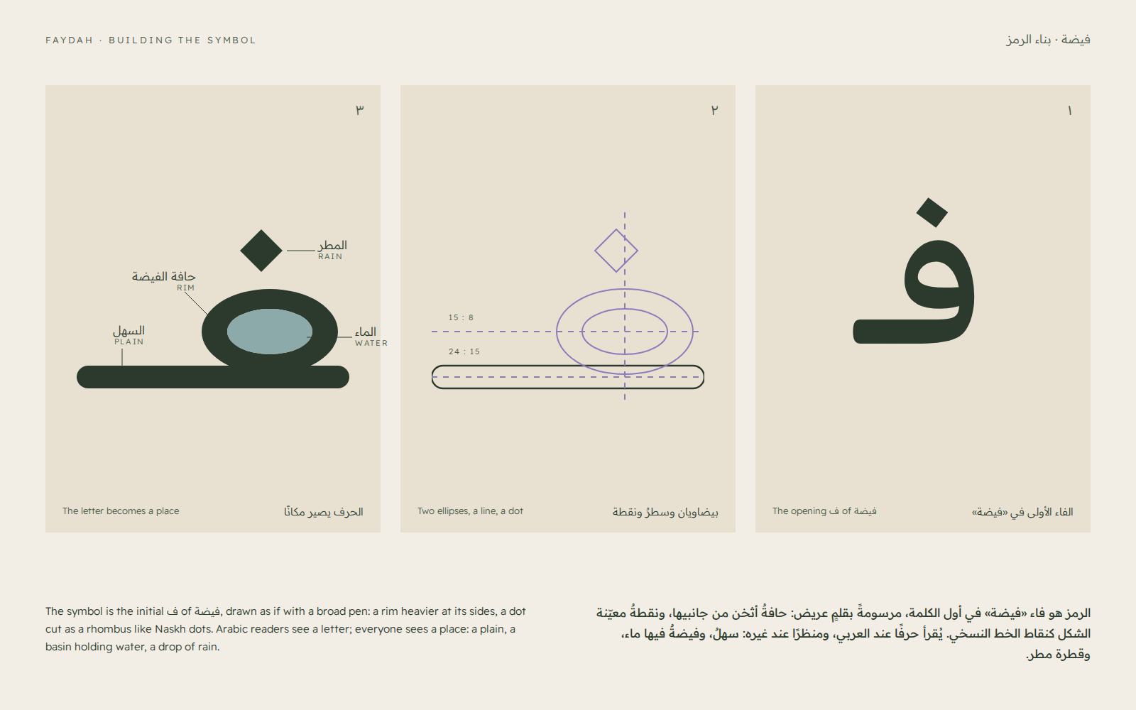
The symbol is the opening ف of فيضة drawn as a landscape: the joining stroke is the plain, the loop is the basin’s rim, its counter holds water in Pool, and the rhombus dot is a drop of rain. Arabic readers see a letter; everyone sees a place.
The Arabic name is set in Markazi Text at weight 600 and outlined; the Latin name is Readex Pro in spaced capitals. In the horizontal lockup the symbol’s plain sits on the word’s own baseline, so the two read as one horizon. A one-colour version handles debossing and foil, and the symbol holds up down to 16 px.
Typography
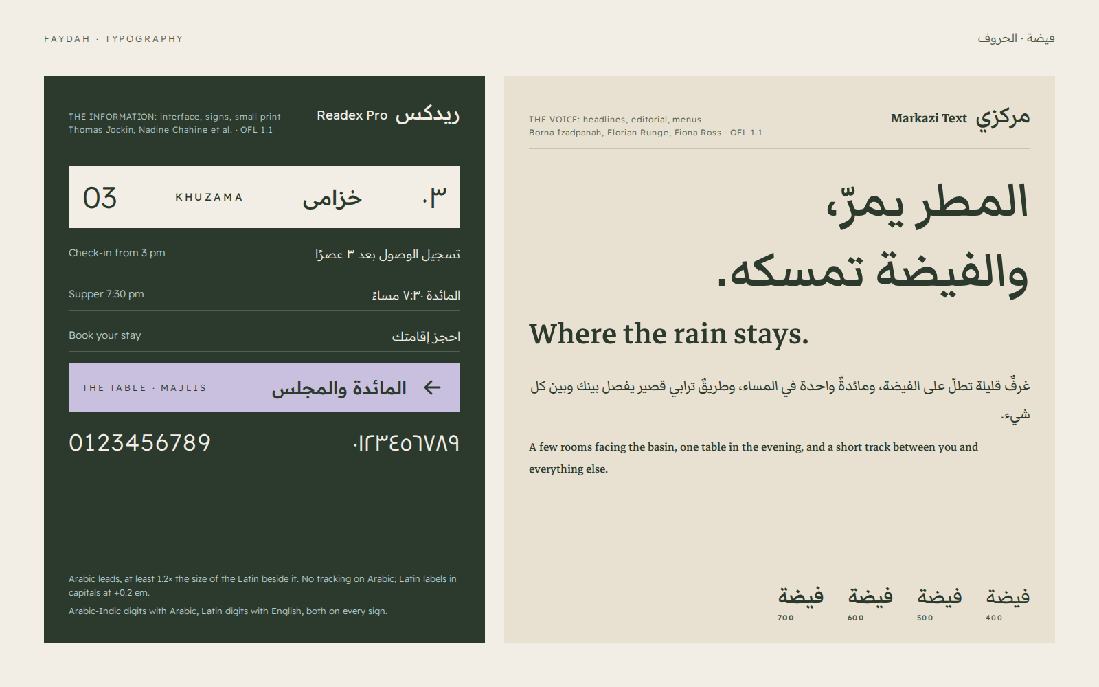
Two open-licensed families (OFL 1.1), each with one job. Markazi Text, by Borna Izadpanah, Florian Runge and Fiona Ross, is the voice: a calm Naskh with a matching Latin, for headlines, editorial copy and menus.
Readex Pro, by Thomas Jockin, Nadine Chahine and others, carries information: interface, signs, small print. Arabic always leads and is set larger than the Latin beside it; Arabic-Indic digits go with Arabic and Latin digits with English, and every sign carries both. Both fonts are vendored with their licences in the case study’s source.
Colour
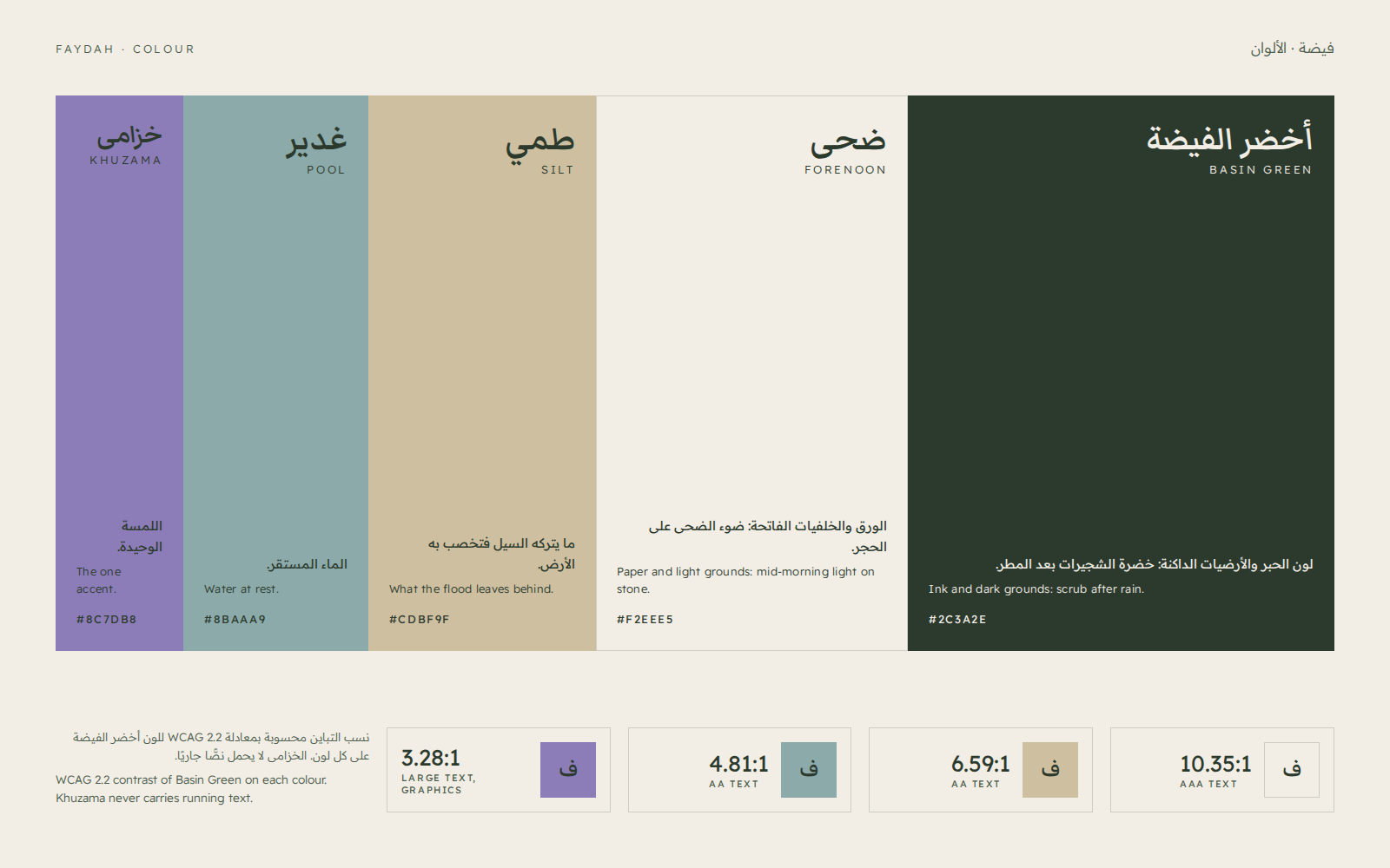
The palette is the basin after rain: Basin Green for ink and dark grounds, Forenoon for paper, Silt for what the flood leaves behind, Pool for water at rest, and Khuzama, the one accent, from the spring bloom.
Basin Green reaches 10.35:1 on Forenoon, 6.59:1 on Silt and 4.81:1 on Pool, all passing WCAG AA for text. Khuzama (3.28:1) is kept for graphics and large type and never carries running text.
Palette
- Basin Green
#2C3A2E - Forenoon
#F2EEE5 - Silt
#CDBF9F - Pool
#8BAAA9 - Khuzama
#8C7DB8
05
Applications
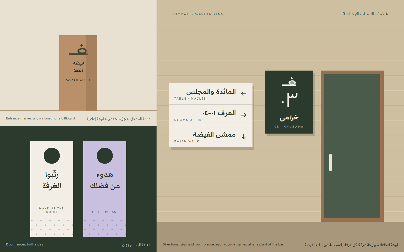
Wayfinding stays low and quiet: the entrance marker is a short stone, not a billboard; each room carries its number and the name of a plant of the basin; the two-sided door hanger carries the rain pattern, rhombus dots falling on a slant.
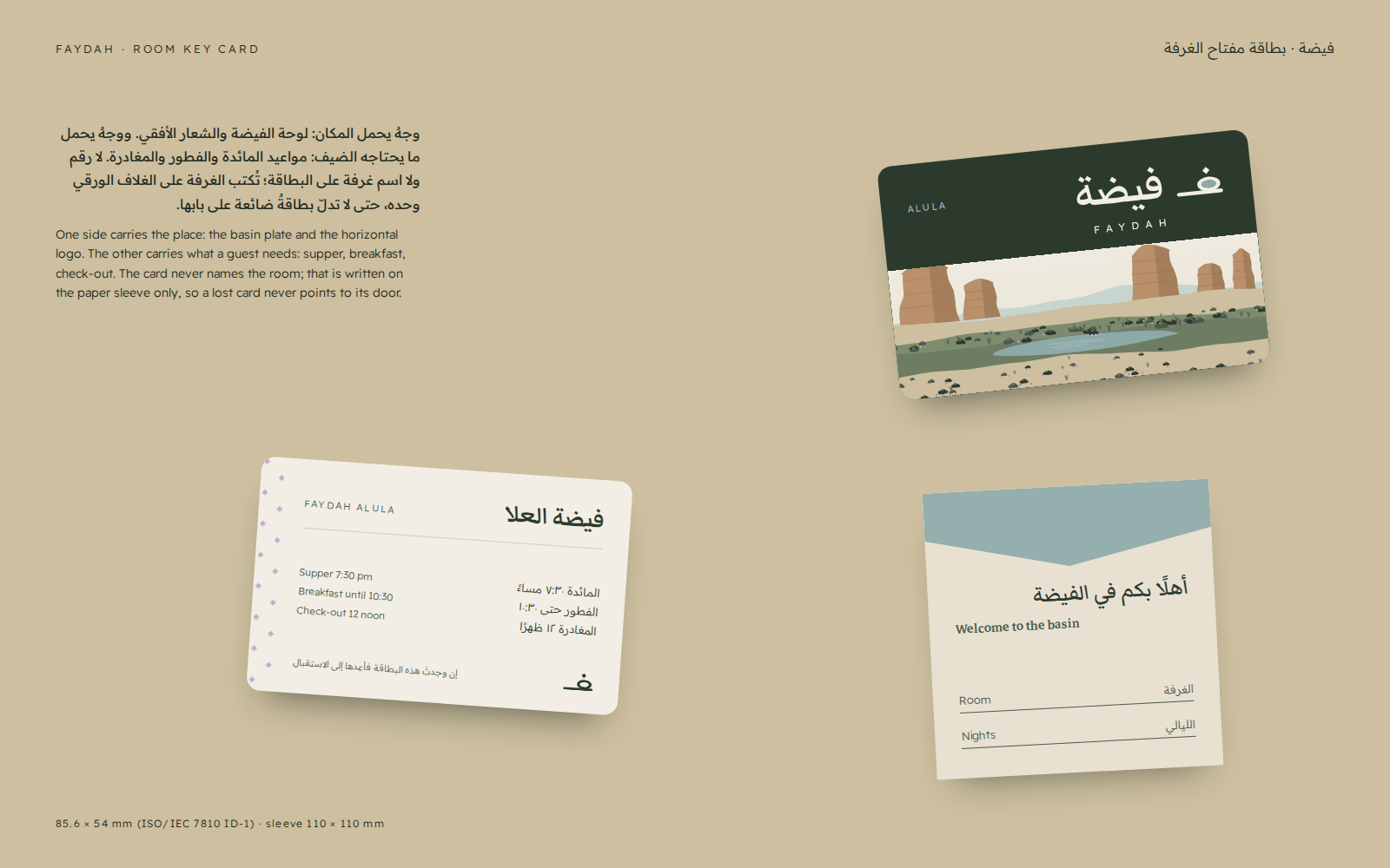
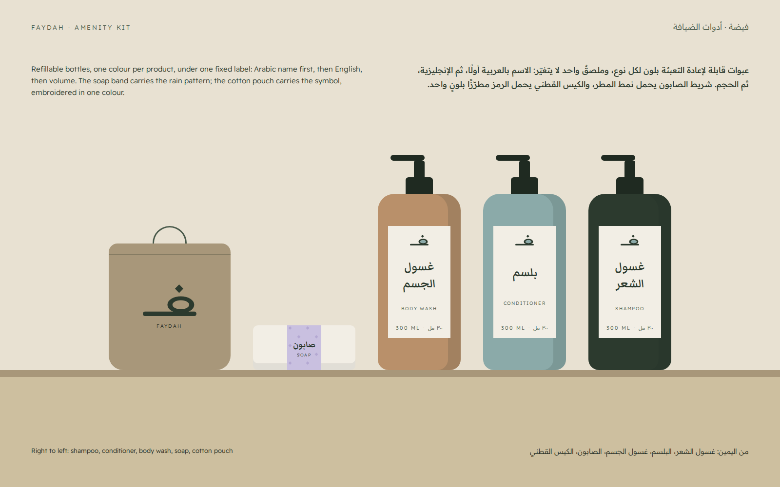
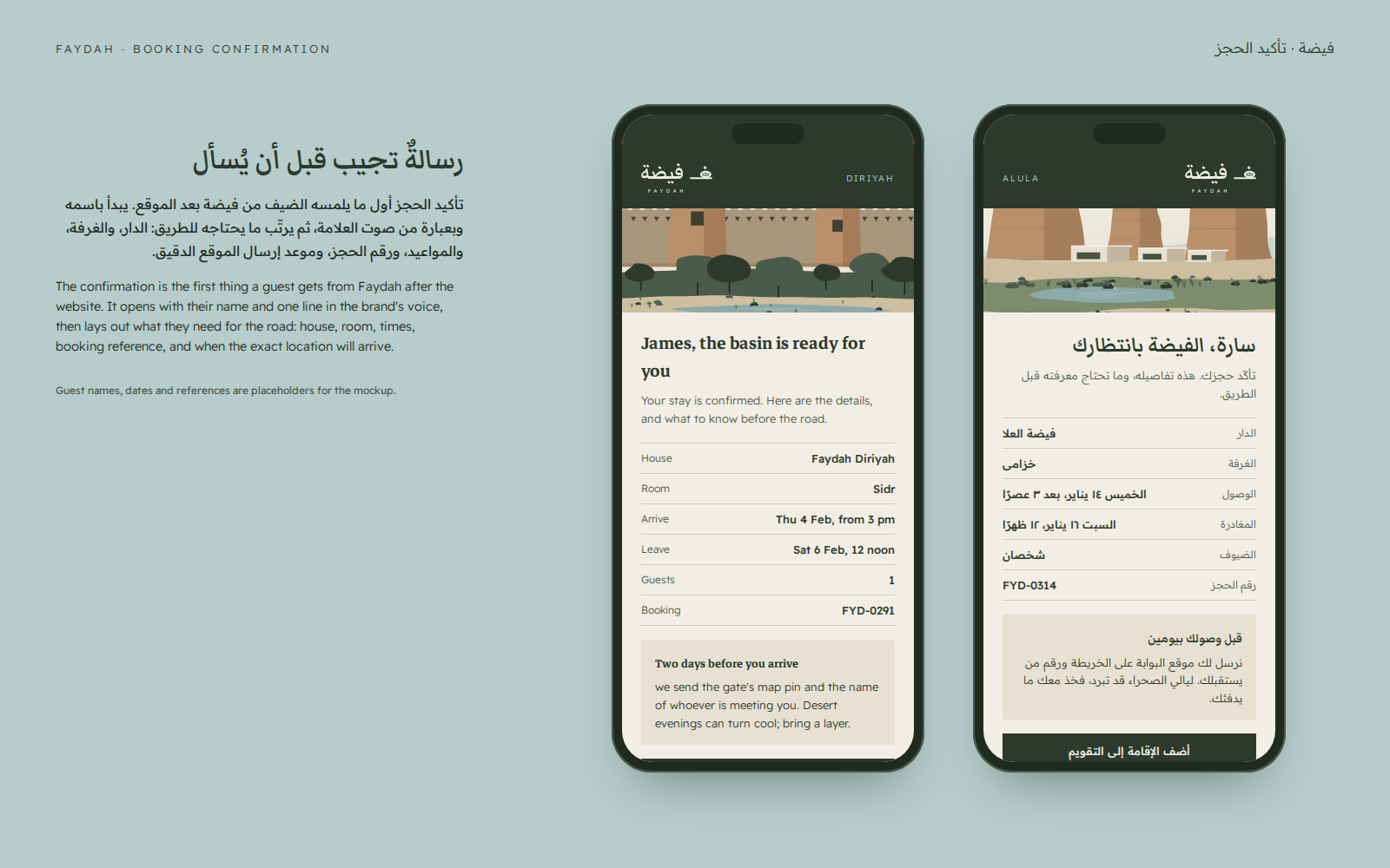
The key card never names the room; the room is written on the paper sleeve only, so a lost card never points to its door. The amenity kit uses refillable bottles, one colour per product under one fixed label. The booking confirmation opens with the guest’s name, then lays out what they need for the road. Names, dates and booking references in the mockups are placeholders.
06
Website
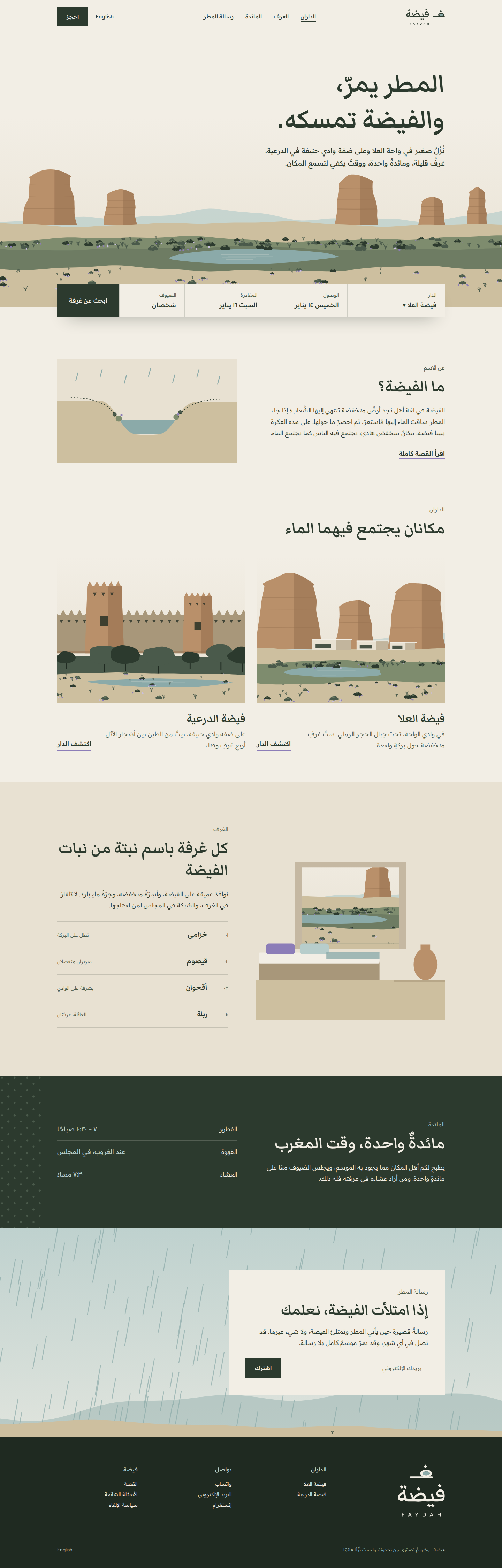
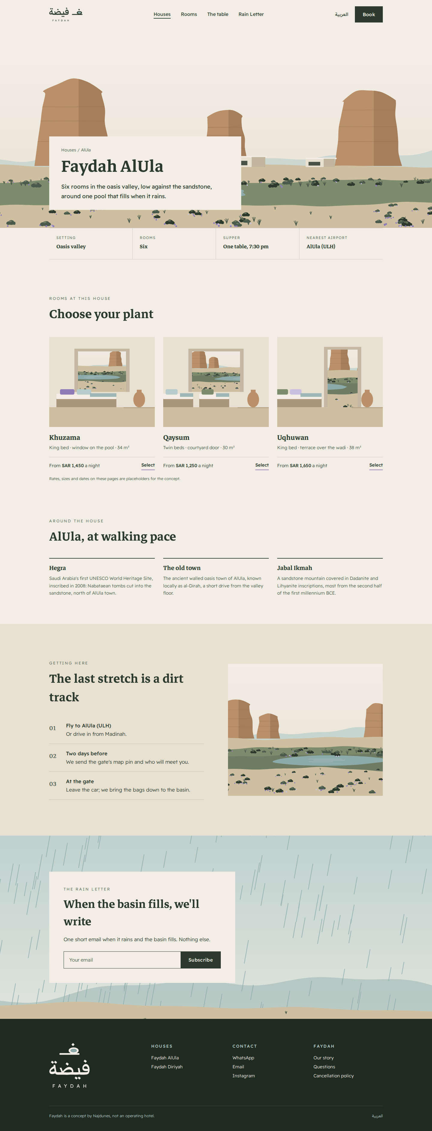
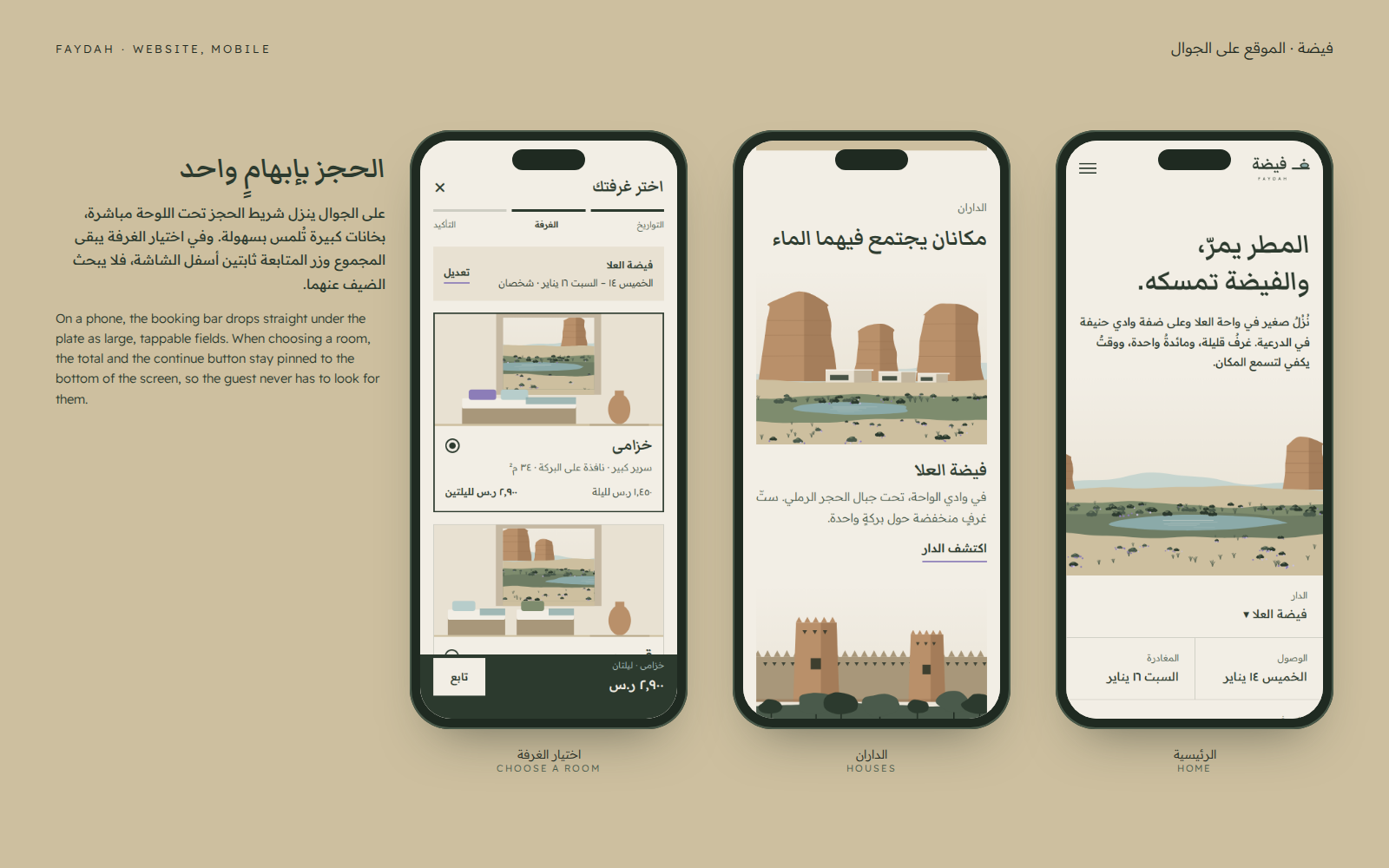
Arabic first and right to left, with an English version written separately. The home page opens on the basin plate with the booking bar directly beneath it, then the name, the two houses, the rooms, the table and the Rain Letter. The house page leads with the place, its facts and its rooms.
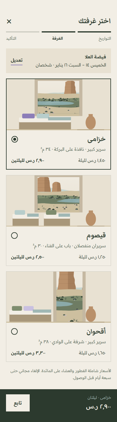
On a phone the booking bar drops under the plate as large fields, and when choosing a room the total and continue button stay pinned to the bottom of the screen. The illustrated plates stand in for commissioned photography in this concept; rates, sizes and dates are placeholders.
Desktop
Mobile


07
Why it looks the way it does
Every choice in the identity and the site has a reason. These are the ones that matter most.
A name from Najdi geography, not from the luxury lexicon
Faydah is a word Najdi Saudis know, tied to real places, and it carries the whole story by itself: water that arrives and stays. Trademark, e-store register and booking-platform searches showed no conflict; the official Ministry of Commerce trade-name search is still owed before any real use.
The symbol is a letter before it is a picture
Drawing the ف as a landscape ties the mark straight to the Arabic word: Arabic readers need no explanation, and everyone else still gets a clear picture of a plain, water and a drop. Tents, palms and camels were ruled out because they are the stock images every desert stay already uses.
Green and water instead of sand colour
Most desert brands are beige. A faydah is the moment the desert turns green, so green is the main ink, Pool is the water and Khuzama the single accent. The brand stands apart in the region and stays true to its name.
Two typefaces with two clear jobs
Markazi gives headlines the warmth of written Naskh, while Readex stays legible on a sign seen from across a courtyard and in a small booking interface. Both are open-licensed, so a new founder pays nothing in font licences.
Illustrated plates instead of stock photography
Stock photos make every stay look alike, and a concept has no real building to shoot. Plates drawn only from the brand palette, one per house and per room, hold the place for photography until there is a real place to photograph.
Booking first on mobile, Arabic first everywhere
We designed for the phone first: the booking bar sits right under the plate and the total stays pinned to the bottom of the screen. The pages use logical (start and end) layout rules, so Arabic and English share one stylesheet rather than one being a mirrored afterthought.
Want this depth for your own brand?
Tell us about your project in a short brief, and we’ll come back to you with a clear next step.