

Concept / Self-initiated
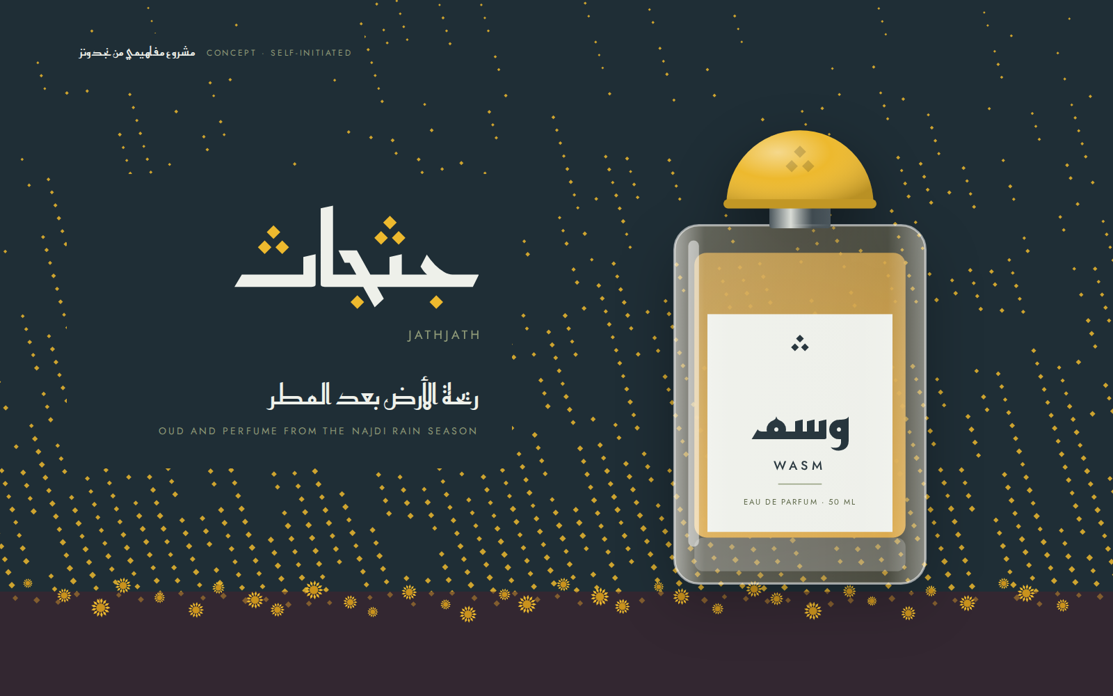
Jathjath
جثجاث
Identity, packaging and an online shop for a concept oud and perfume house from Riyadh, built on a Najdi desert flower and the autumn rains that wake it.
- Sector
- Oud and perfume house
- Services
- Brand Kit, Packaging, Website
- Project
- Concept / Self-initiated
01
The brief
Jathjath is an oud and perfume house we invented in Riyadh. No client asked for it: it is a self-initiated concept that tests one question. How does a new house enter a market where the leaders compete on their age, without pretending to a past it doesn’t have?
The scope: a name checked against registers and marketplaces, an Arabic and Latin logo, type and colour, full packaging for two perfumes, an oud oil, bakhoor and a gift box, and an online shop that opens in Arabic and works just as well in English.
Because the house is imaginary, this study carries no sales figures and no customer quotes. Every fact in it names its source.
02
Research
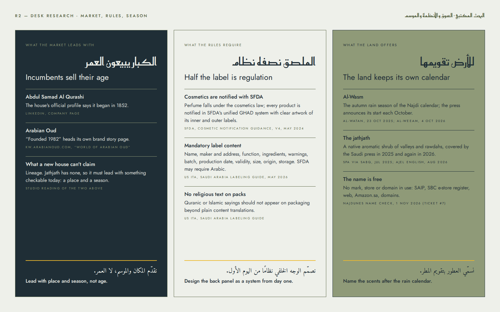
The market first. The biggest names lead with their age: Abdul Samad Al Qurashi’s official LinkedIn profile says the house began in 1852, and Arabian Oud opens the brand story on its own site with “Founded 1982”. A new house can’t win that argument, so it has to stand on something a customer can check today.
Then the rules. SFDA’s definition of a cosmetic product covers perfuming, and every product must be notified through its Unified Electronic System, GHAD, with clear artwork of its inner and outer labels (SFDA, Guidance of Regulations and Requirements for Cosmetic Products Notification, version 4, May 2024). The US International Trade Administration’s labeling guide for Saudi Arabia (May 2026) lists what a cosmetic label must carry: name, maker and address, function, ingredients, warnings, batch, production date, validity, size, origin and storage. It notes that SFDA may require Arabic and advises against religious text on packs. Half the label is regulation, so it has to be designed in from the start.
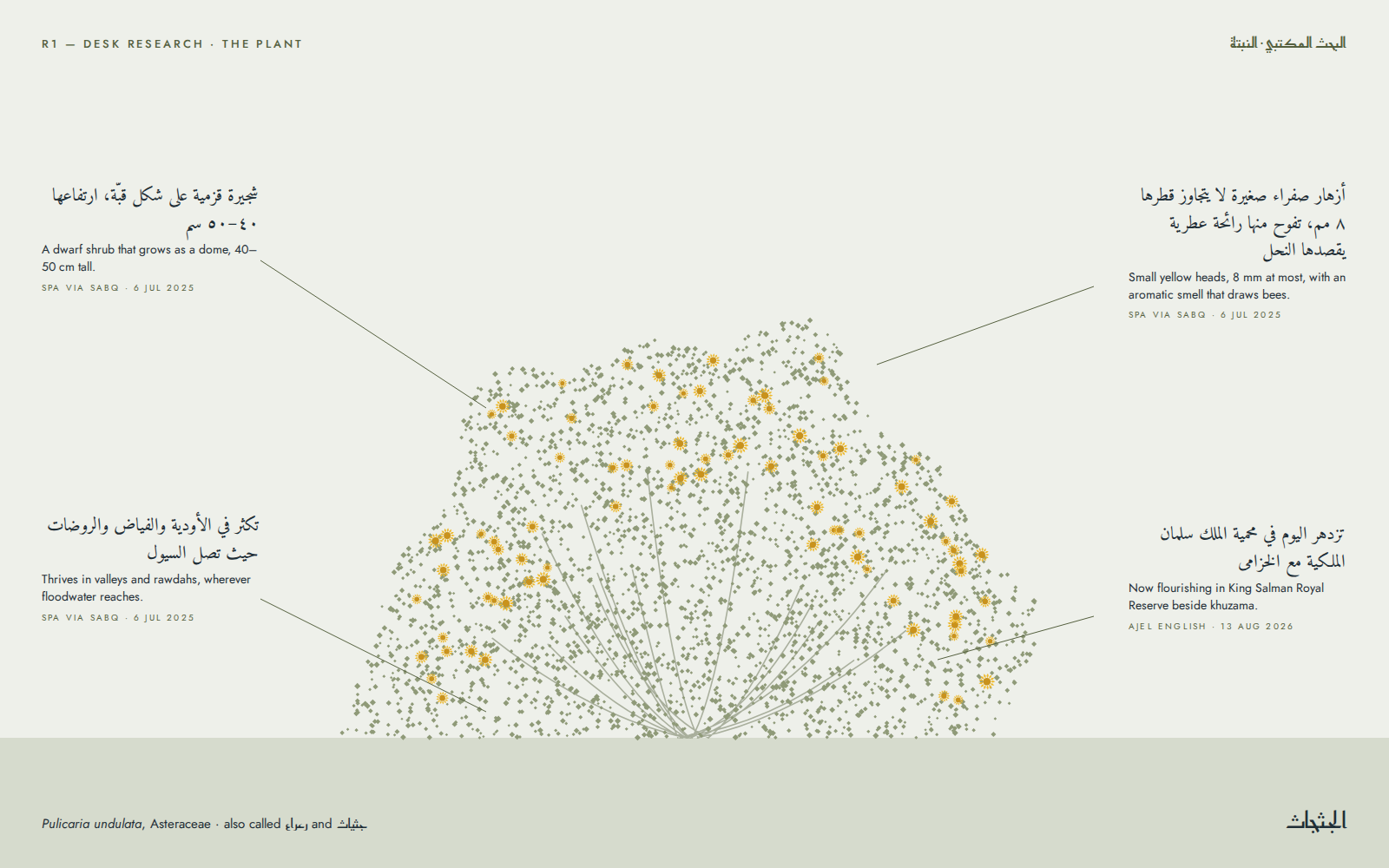
Then the land. Jathjath, Pulicaria undulata, is a dwarf shrub of the daisy family that grows as a dome 40 to 50 cm tall. In spring it carries yellow heads no wider than 8 mm, with an aromatic smell that draws bees, and it thrives in valleys and rawdahs wherever floodwater reaches (SPA via Sabq, 6 July 2025). Ajel English reported it flourishing in King Salman Royal Reserve beside khuzama on 13 August 2026. Al-Wasm is the autumn rain season of the Najdi calendar, and the press follows its start every autumn (Al-Watan, 23 October 2025; Al-Weeam, 4 October 2026).
The name itself came up clean in the Saudi Authority for Intellectual Property’s trademark search, the Saudi Business Center’s register of authenticated e-stores, web and Amazon.sa searches and domain lookups (Najdunes name check, 1 November 2026). The official Ministry of Commerce trade-name search still has to be run before any real use.
03
Strategy
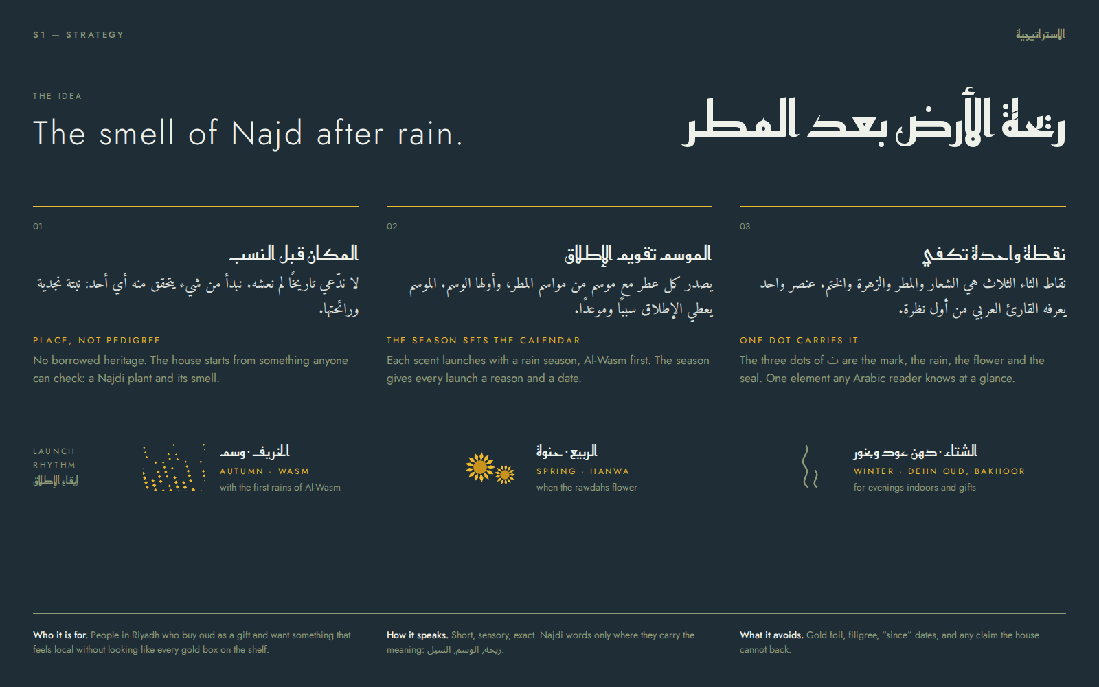
The idea: the smell of Najd after rain. Anyone who has lived in Najd knows that smell, and it describes what a perfume does: it brings back one particular moment.
Place, not pedigree. The house claims no history. It starts from a plant anyone can look up and smell, and it names its sources when it talks about it.
The season sets the calendar. Each scent launches with a rain season: Wasm with the autumn rains, Hanwa in spring when the rawdahs flower, Dehn Oud and bakhoor for winter evenings and gifts. Every launch gets a reason and a date. Hanwa takes its name from an annual herb of the Riyadh region with fragrant yellow flower heads (Arabic Wikipedia, “List of plants of Riyadh Region”; SPA, 7 September 2026).
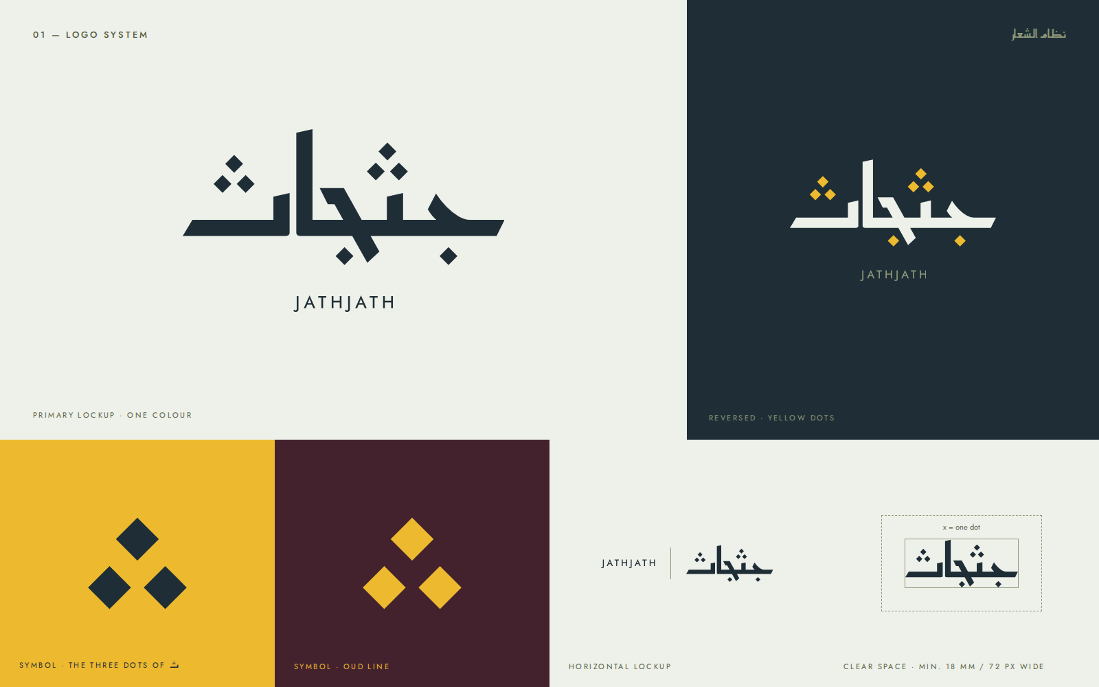
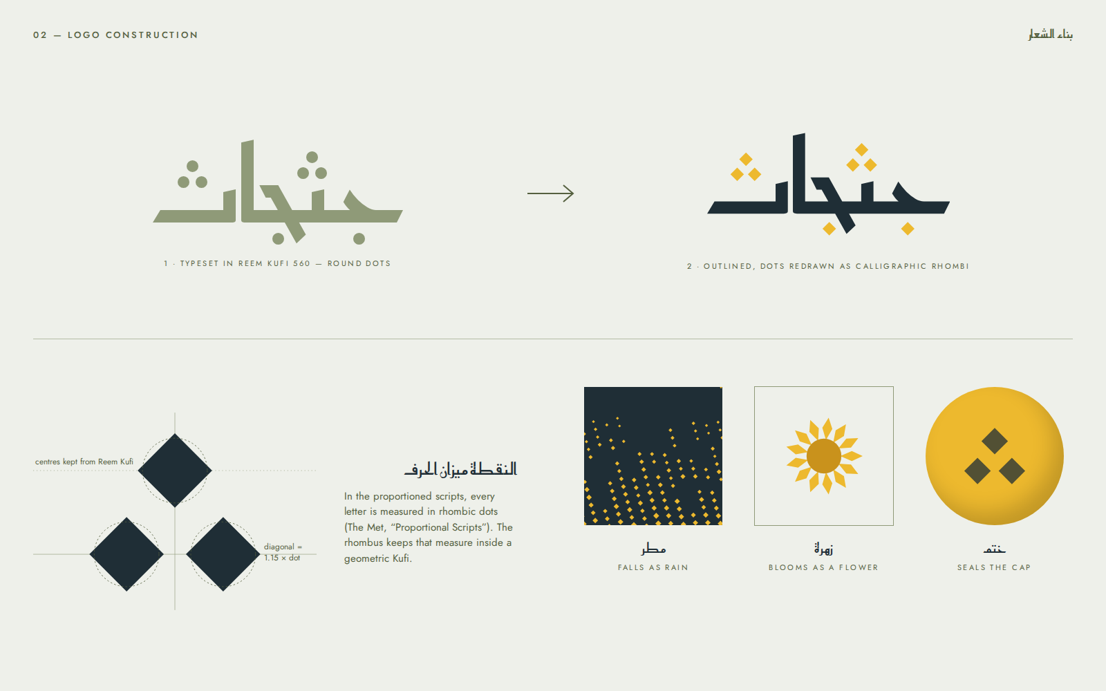
One dot carries it. The three dots of ث are the mark, the rain, the flower and the seal: one element any Arabic reader knows at a glance, and enough on its own to pick the product out on a shelf.
04
Identity
Logo
Jathjath is written with two ث, and each ث carries three dots. The logo is built on that fact: the letters are drawn on the skeleton of Reem Kufi at weight 560, and the round dots are replaced by calligraphic rhombi on the same centres, each with a diagonal 1.15 times the width of the round dot.
The rhombus isn’t decoration. In the proportioned scripts every letter is measured in rhombic dots (The Met, “Proportional Scripts”), and the wordmark carries that old unit of measure into a modern geometric Kufi.
The symbol is the three dots alone, lifted from the wordmark unchanged. It is pressed into the dome of every cap and printed on every carton lid, and in the pattern it becomes rain. The Latin wordmark, in widely tracked Jost capitals, sits under the Arabic and never competes with it.
Typography
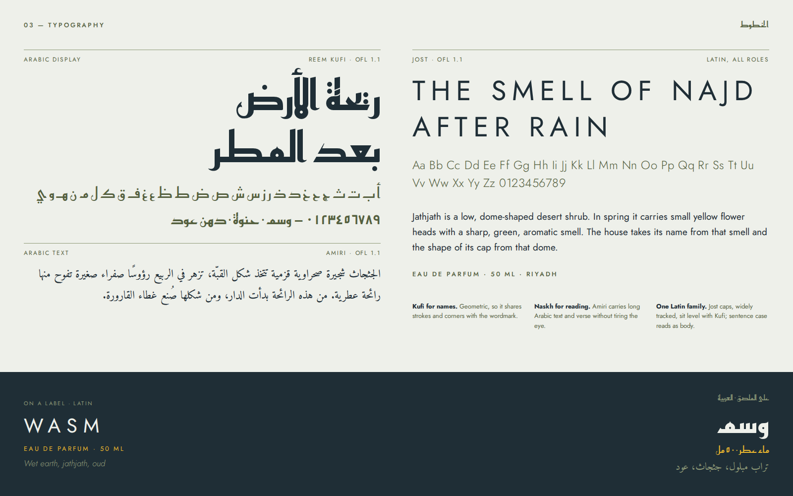
Three families, all under the SIL Open Font License 1.1, with the font files and their licences kept alongside the project.
Reem Kufi sets names and headings: it is the skeleton the wordmark was drawn on, so headings share its corners and stroke weights. Amiri carries long Arabic text and verse, where Naskh rests the eye and Kufi would tire it. Jost covers all Latin, in widely tracked capitals for headings and in sentence case for reading.
Colour
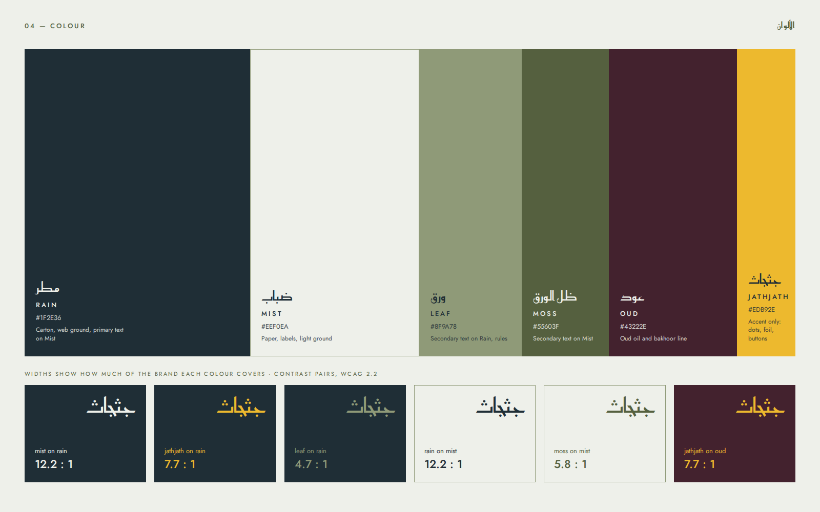
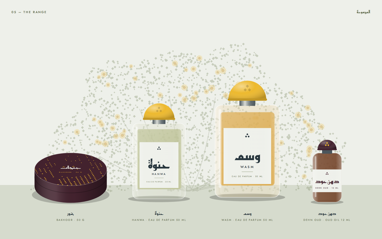
The palette comes from the moment of rain itself: Rain, the blue slate of a storm cloud; Mist, a cool white for paper; Leaf and Moss from the olive leaves of the jathjath; Oud, the dark resin of the oil and bakhoor line; and Jathjath, the yellow of the flower.
Yellow is an accent, never a ground for reading. It appears in dots, the symbol and buttons only, and never as text on Mist, where it reaches just 1.6:1. Every approved text pairing clears 4.5:1.
Palette
- Rain
#1F2E36 - Mist
#EEF0EA - Leaf
#8F9A78 - Moss
#55603F - Oud
#43222E - Jathjath
#EDB92E
05
Packaging
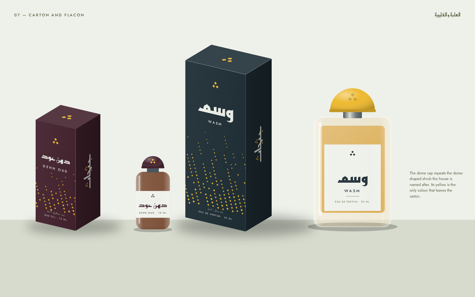
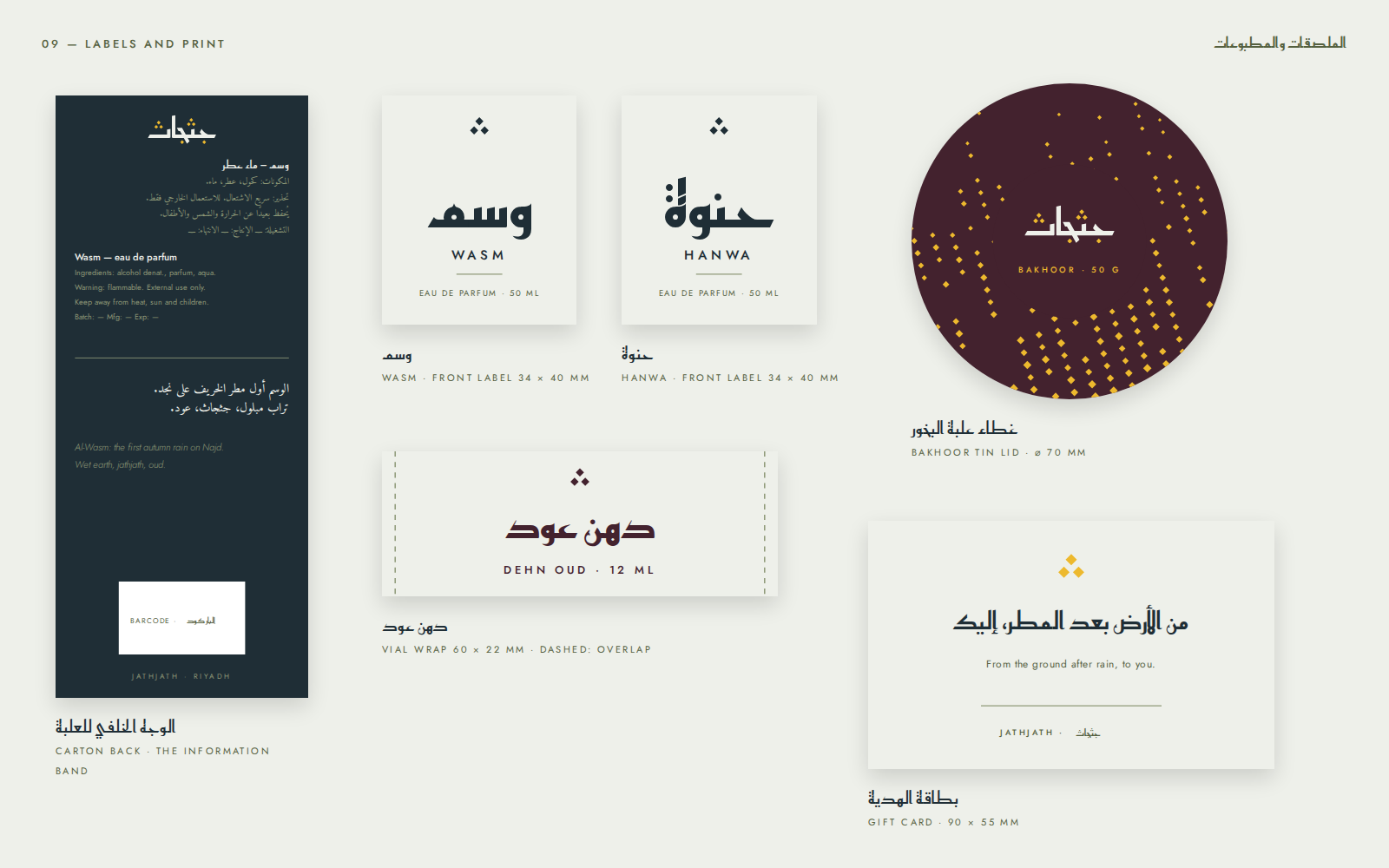
The flacon is a heavy block of glass under a dome cap, and the dome is the shape of the jathjath shrub as SPA describes it. The cap is yellow for the perfumes and resin-dark for the oud line, with the three dots pressed into both.
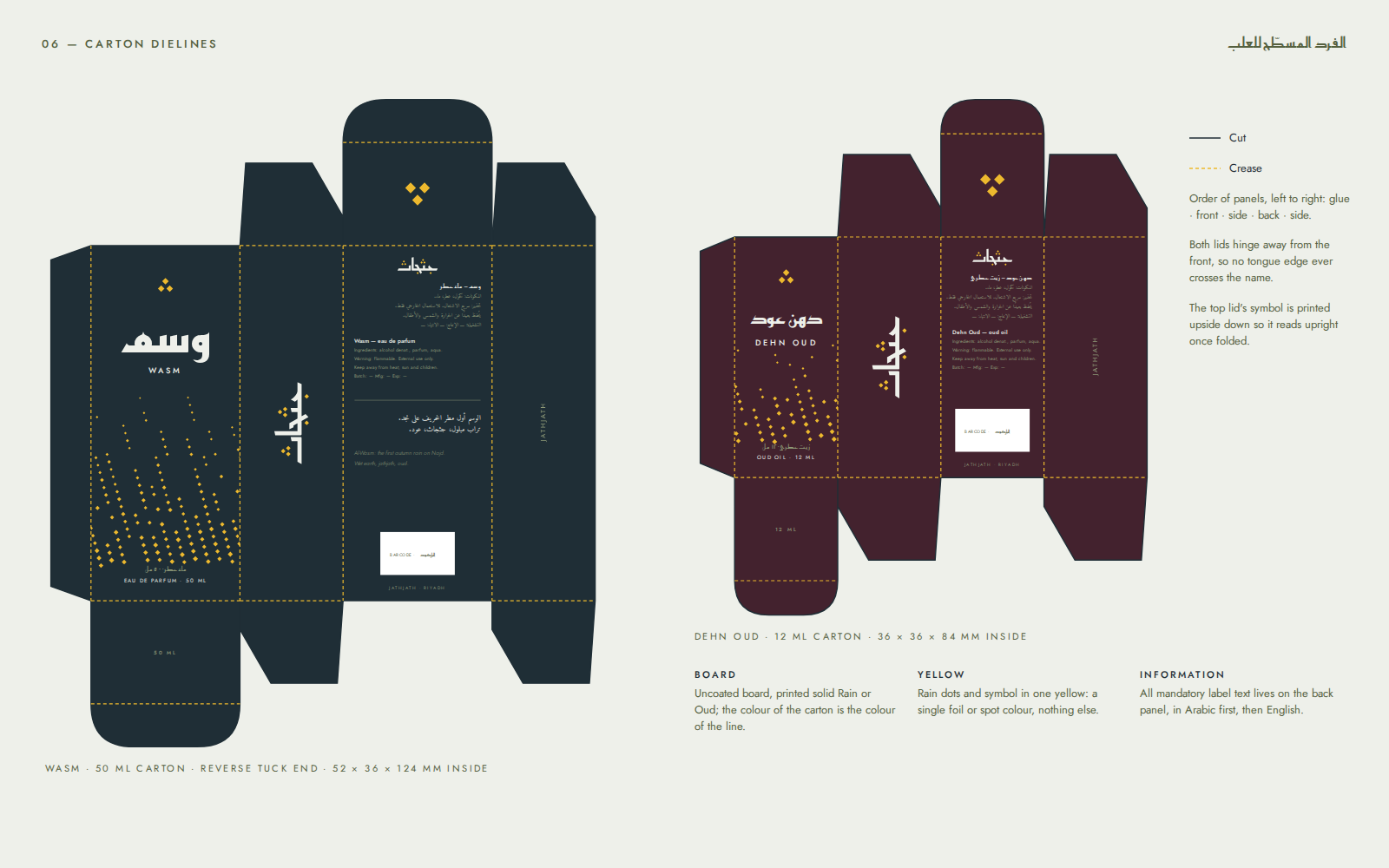
The cartons are reverse tuck end: 52 × 36 × 124 mm inside for the 50 ml flacon and 36 × 36 × 84 mm for the oud oil. Both lids hinge away from the front so no tongue edge crosses the name, and the symbol on the top lid is printed upside down so it reads upright once folded. The dielines are generated in code from those dimensions, so they stay correct if the bottle changes.
The back panel is the information band: everything the regulations ask for, Arabic first and English second, in the same order on every product, with space held for the barcode. Batch and date fields are left blank because the product is imaginary.
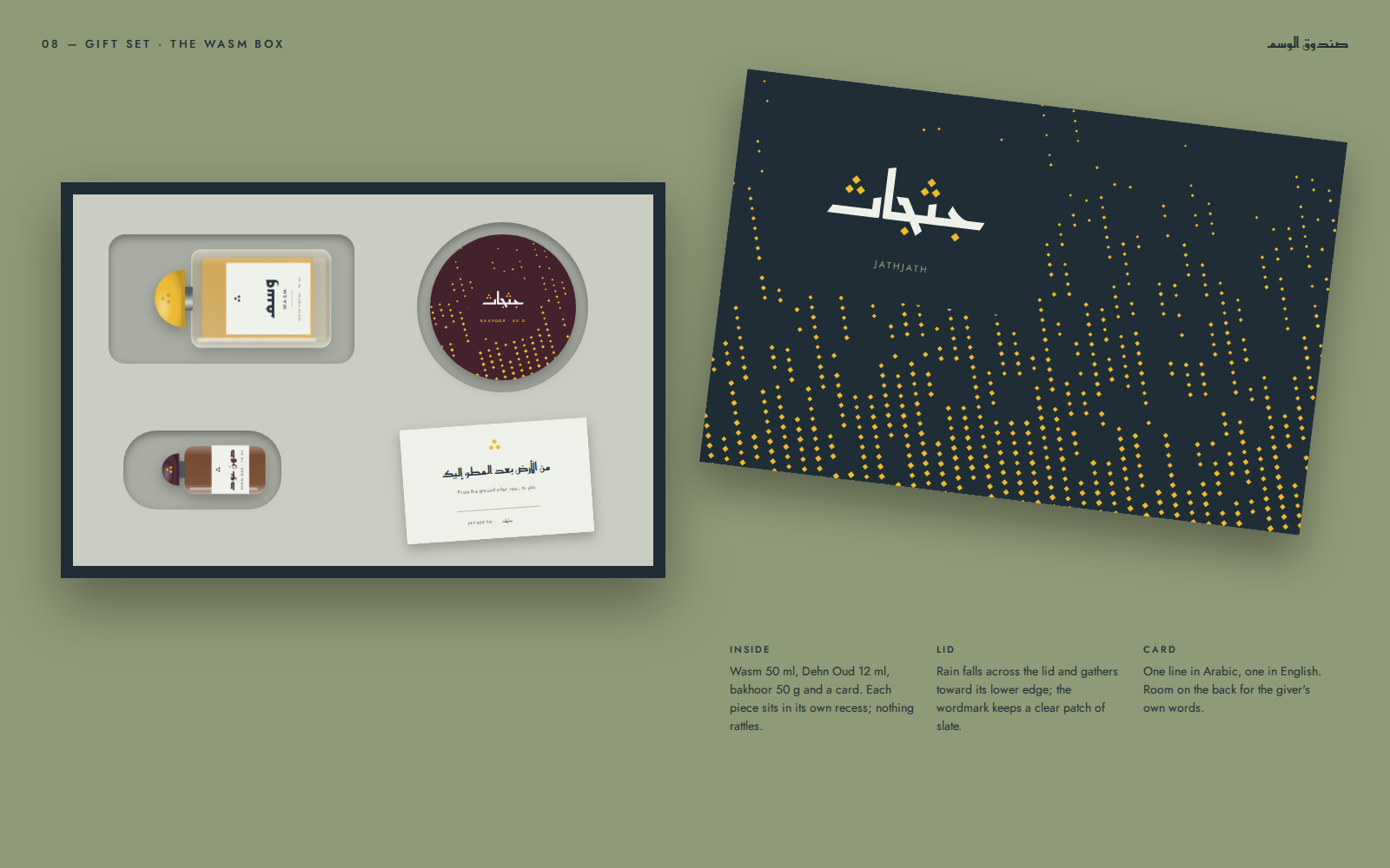
The Wasm box holds the perfume, the oud oil, bakhoor and a card, each in its own recess. On the lid the rain falls and gathers toward the lower edge, leaving the wordmark on clear slate.
06
The online shop
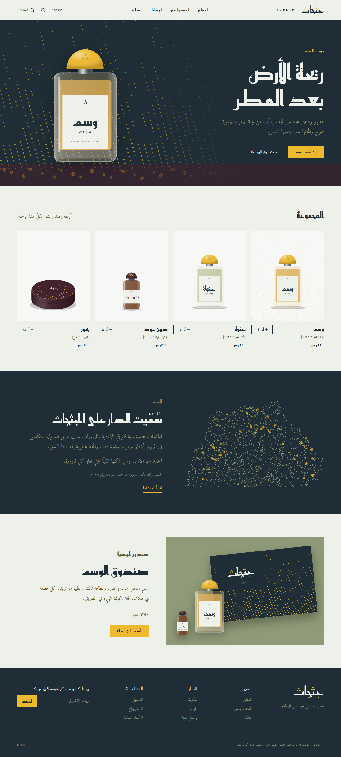
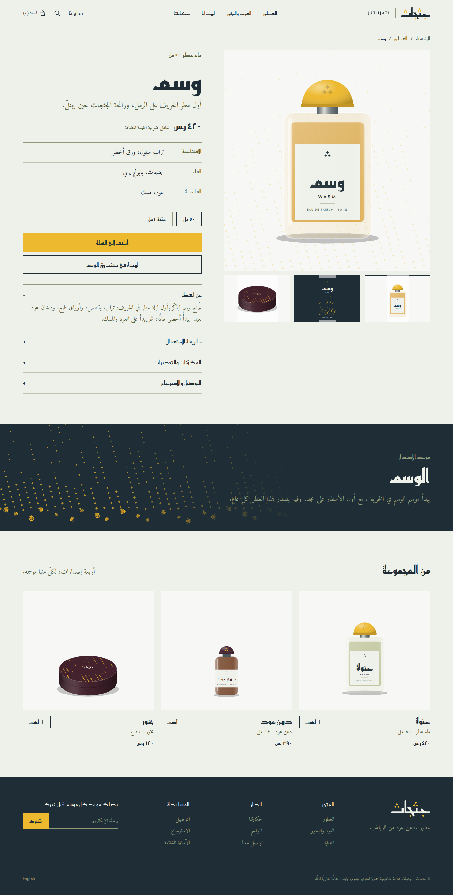
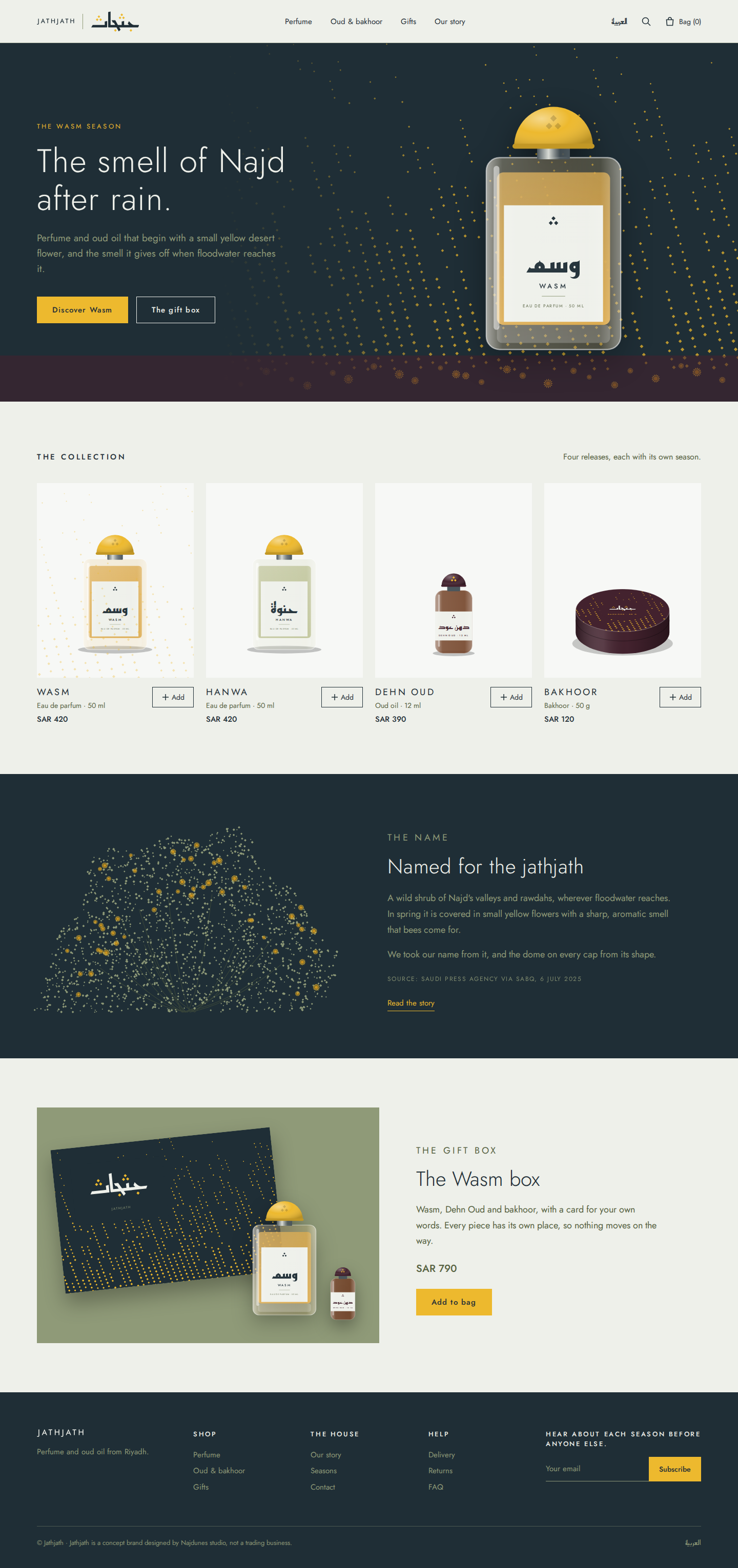
The shop opens in Arabic and is built right to left from the ground up, not mirrored from an English template. The English site is written separately, in the same voice.
The home page opens on rain falling around the Wasm flacon, then the collection, then the story of the name with its source, then the gift box. The product page sets the notes out in a plain table and gives the reason for the release: the Wasm season.
On mobile the product comes before the headline, the grid drops to two columns, and the buttons run the full width of the screen directly under the size choice.
Desktop
Mobile



07
Why it looks the way it does
Every choice in the identity and the site has a reason. These are the ones that matter most.
A name from a plant, not a lineage
The leaders in this market lead with their age, and a new house has none. A Najdi plant with a real smell gives it a story that is true and that anyone can check.
The name was also free in every register we could reach, while other aromatic plant names we screened are taken in the trade: Al-Majed Oud holds the Saudi trademark «غضا» (ghada) in the perfumery class, and Zaharat Al Arfaj is a Kuwaiti perfume and oud house (Najdunes name check, 1 November 2026).
The dot is the whole identity
The three dots are already in the name, so an Arabic reader needs no explanation. When the same dot is the logo, the pattern and the seal, a corner of a carton or the top of a cap is enough to identify the product.
Because the pattern is one shape in one colour, a carton needs only one colour on top of its board: a spot yellow or a foil.
A dome cap
SPA describes the jathjath as a shrub that grows in the shape of a dome. The cap carries that shape to the shelf, so the flacon becomes a small portrait of the plant without a single drawn leaf.
The yellow dome is also the one thing that leaves the carton in colour, which makes it recognisable from across a counter.
Storm slate and yellow, not black and gold
We kept away from black, gold foil and filigree on purpose: they announce luxury by borrowing it, and this house wants to be known for rain. Storm-cloud slate has the same depth, and the yellow comes straight from the flower.
Every text pairing was checked against WCAG, which is why yellow stays off light grounds, where its contrast falls to 1.6:1.
Regulation designed in, not added on
A Saudi perfume label carries a long list of mandatory information. Gathering it into one fixed band on the back, in the same order on every product, leaves the front to the name alone and keeps the label artwork SFDA asks for at notification simple to supply.
An Arabic-first shop
The house’s first customers are in Riyadh, so the shop was designed right to left from the first sketch, and the English was written as its own text rather than translated.
Want this depth for your own brand?
Tell us about your project in a short brief, and we’ll come back to you with a clear next step.